Clarity for Registrars. Confidence for Students.
Reimagining Dartmouth’s petition system with structure, visibility, and control
Introduction
Context
Dartmouth College’s Office of the Registrar as a client for the DALI Lab
Problem
Outdated, paper-based process causing inefficiencies for both students and registrars
Solution
Created a registrar-focused dashboard, student profiles, checklists, and streamlined approval flows.
System
D-Plan petitions (students request exceptions to enrollment patterns)
Role
Senior UX/UI Designer, end-to-end ownership (3–4 months, team of 3 designers)
Focus
Registrar workflow and experience (approval, communication, tracking)
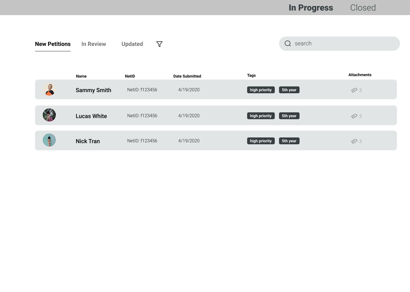
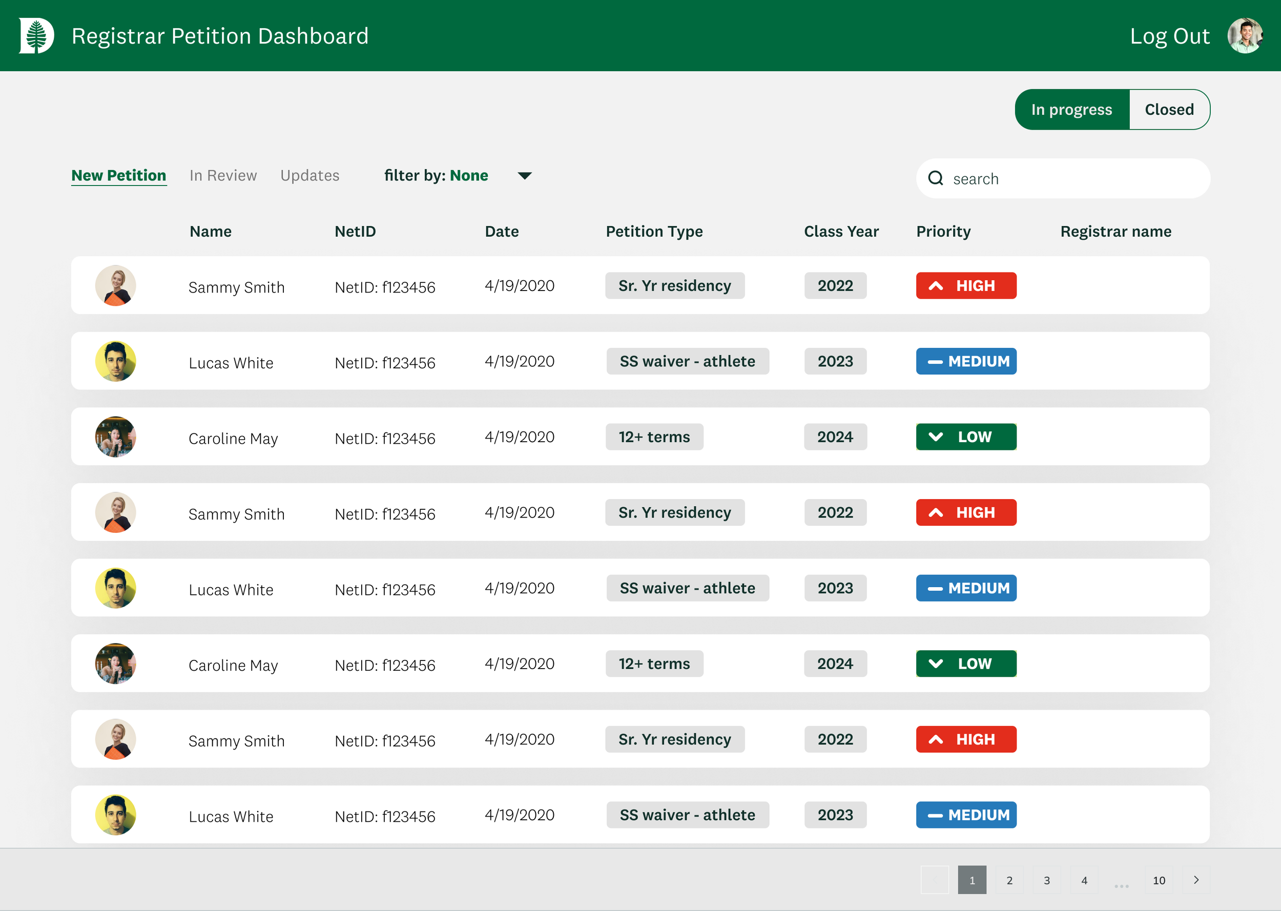
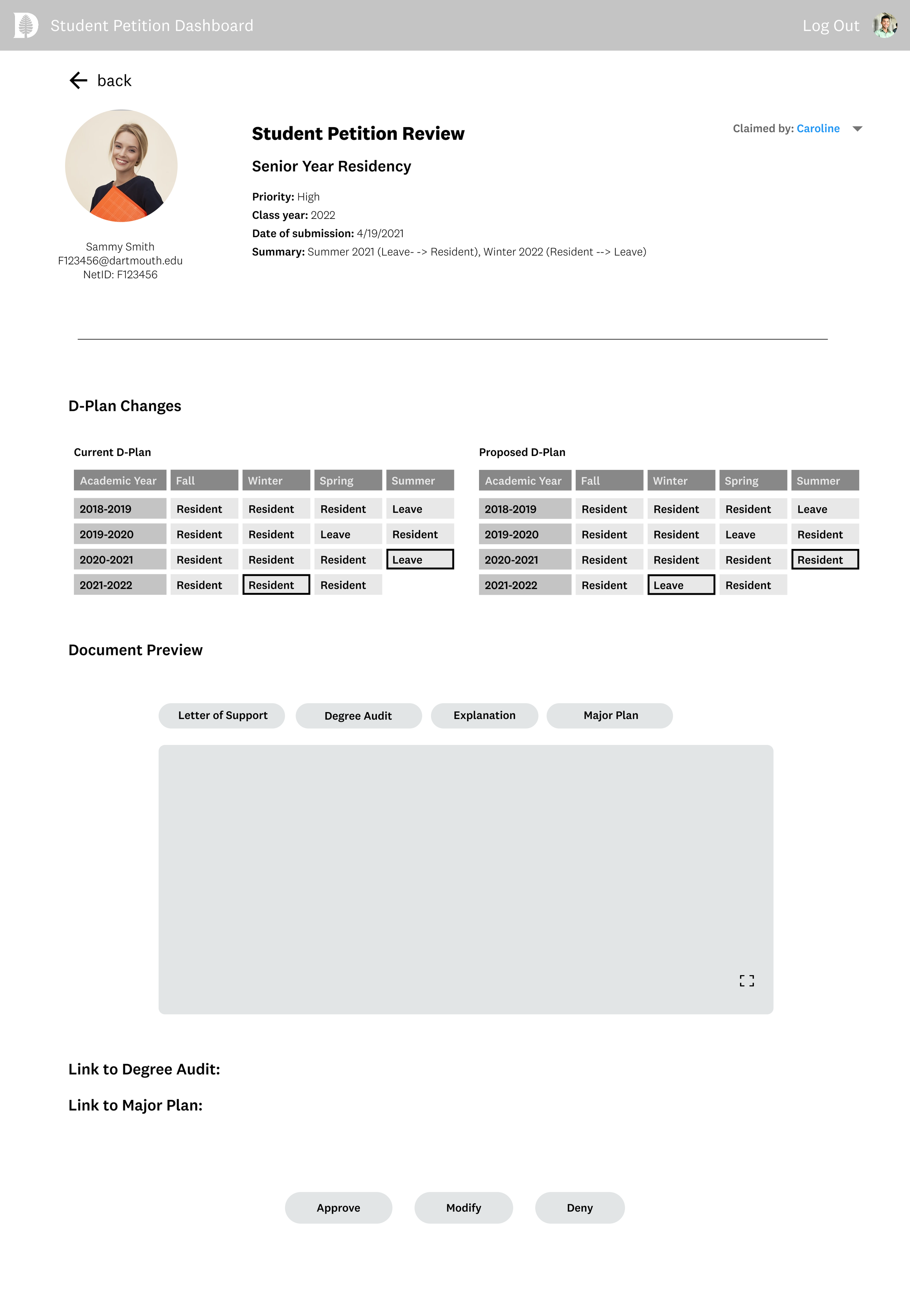
How does the existing system look like?
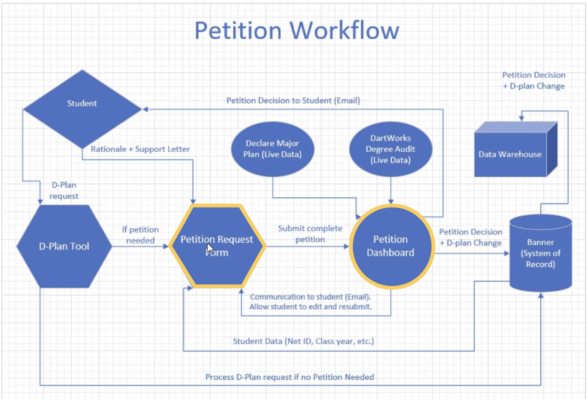
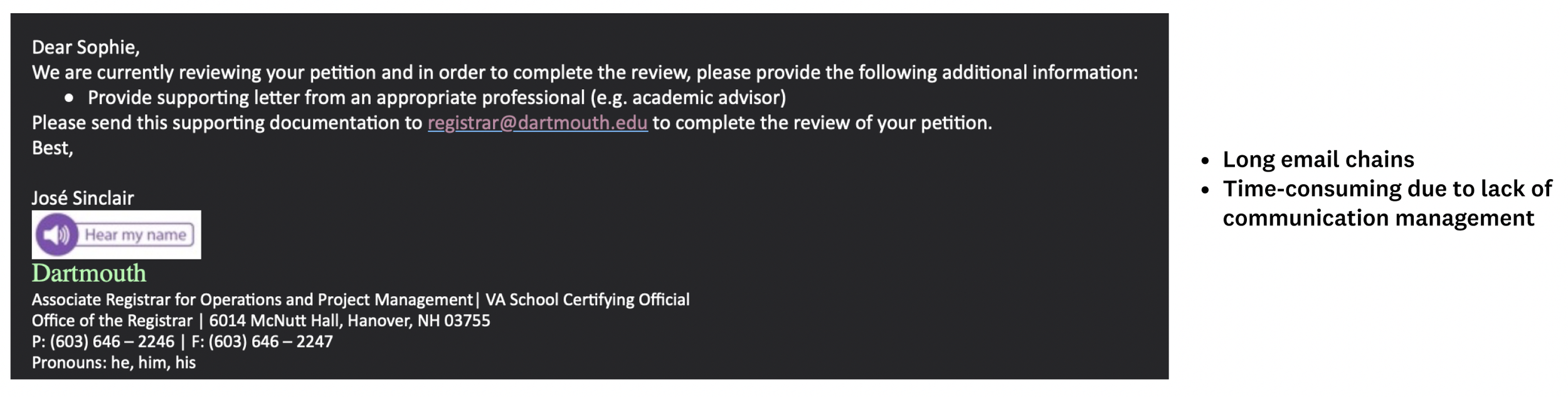
Problem Definition (Registrar POV)
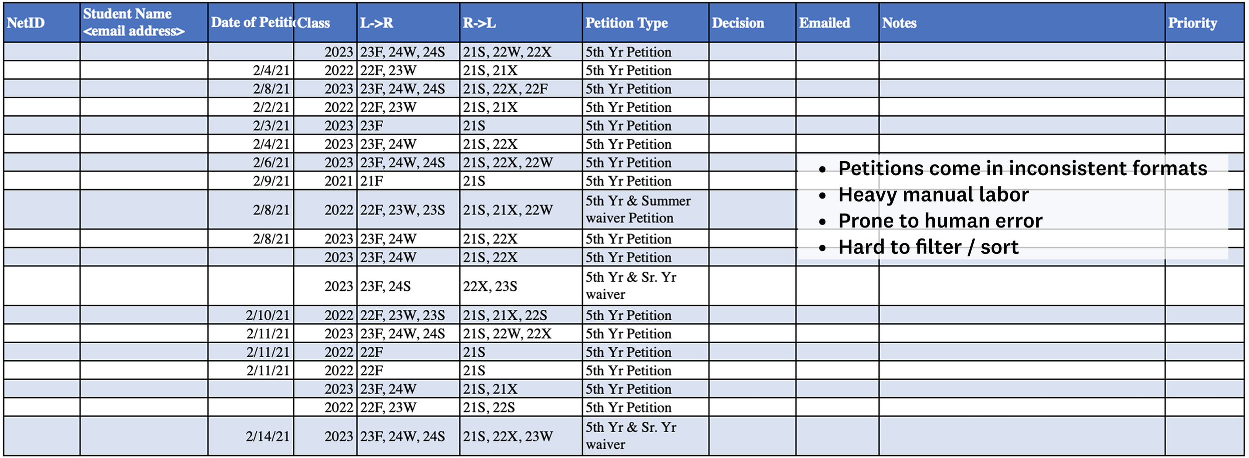
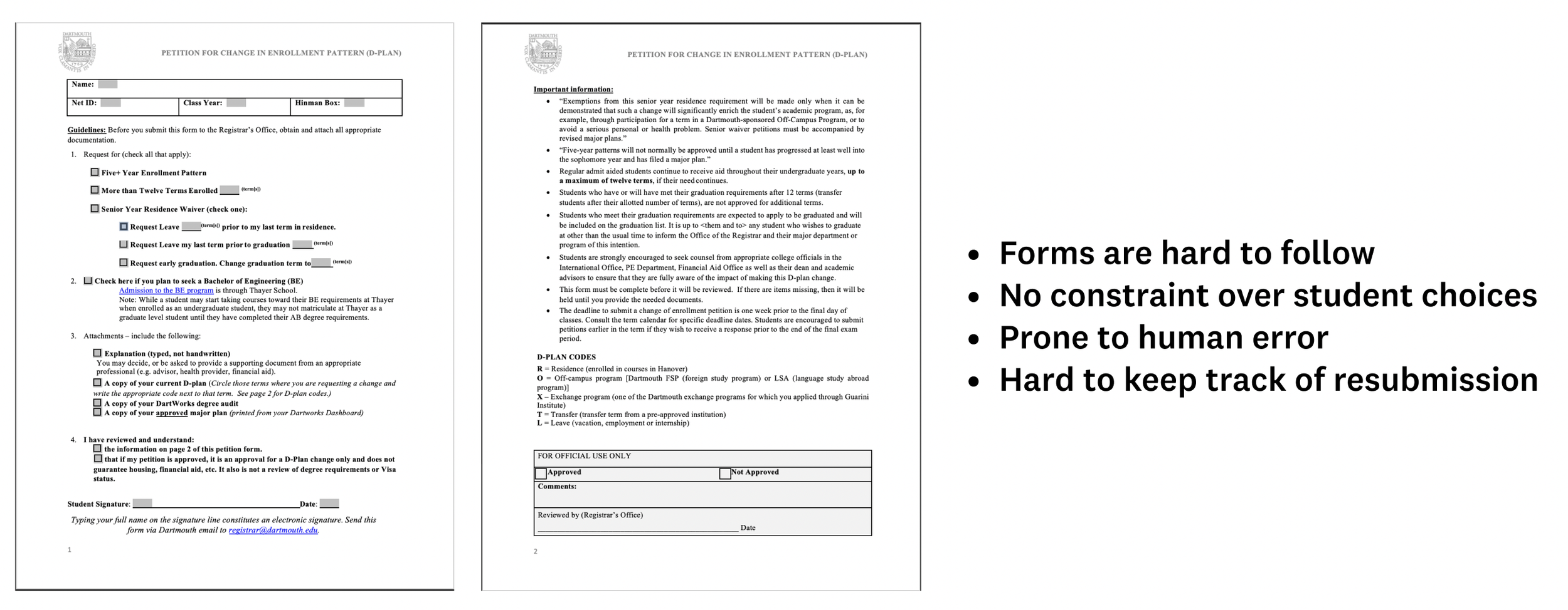
Through interviews and shadowing sessions, I discovered that registrars were frustrated not just by volume, but by chaos:
Petitions arrived in inconsistent and unorganized formats (Excel sheets, PDFs, emails).
It was difficult to tell what a student was asking for.
Communication relied on long email chains that were hard to track.
Time was wasted during every step of the process.
The problem was not only inefficiency but also stress - registrars felt overworked and uncertain.
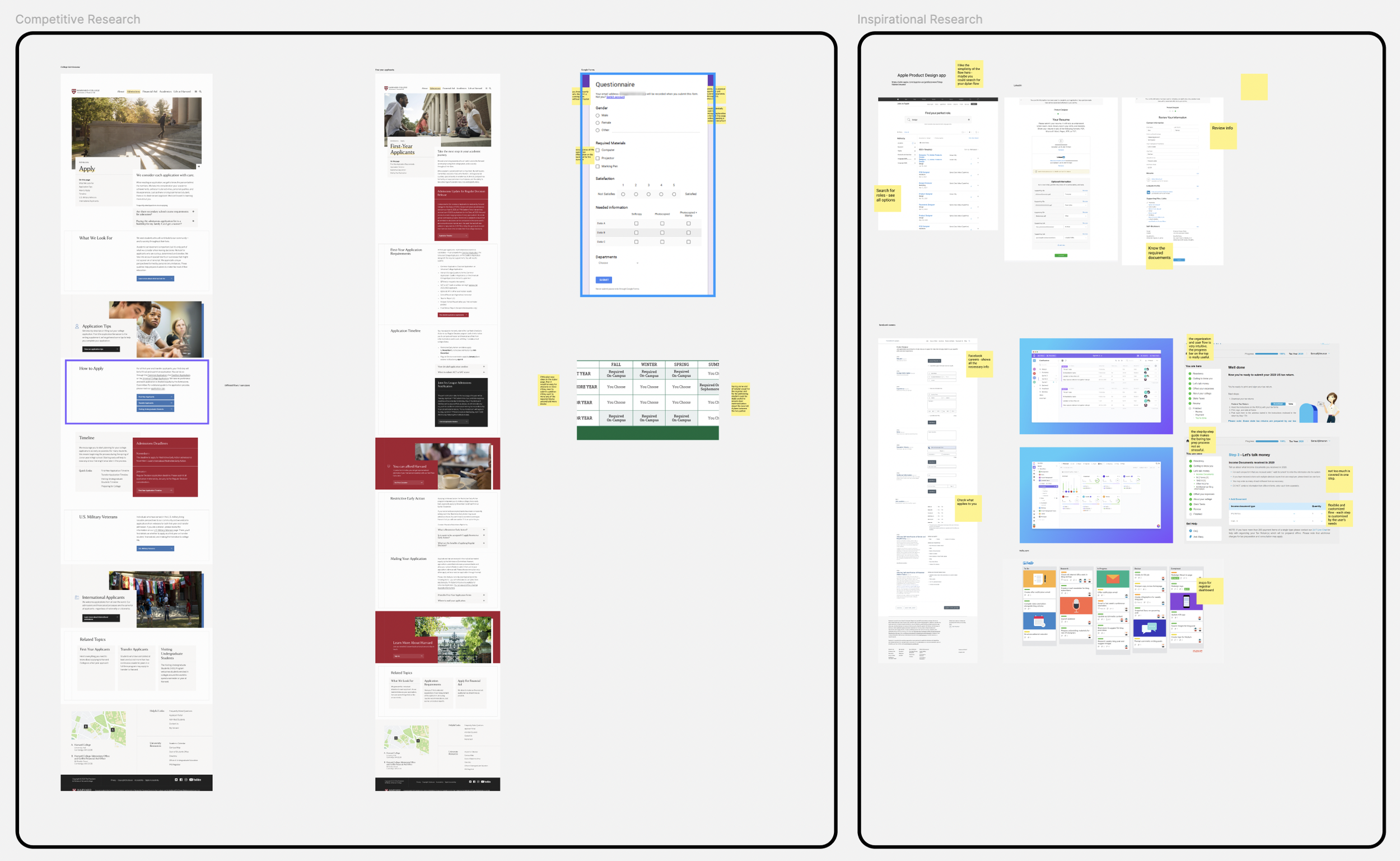
Research & Discovery
Methods: Competitive analysis, inspirational workflows, registrar interviews, shadowing
Tools Studied: Workflow apps like Trello, Zendesk (high-volume request management)
Empathy maps & journeys: Revealed registrar stress points and inefficiencies
Key Insight: Registrars need structure, confidence, and visibility without losing judgment in approvals
Design Strategy
-
Systematic Workflows
Dashboards, checklists, tagging to reduce cognitive load
-
Clarity Over Complexity
Surface only the necessary information at the right moment
-
Control & Confidence
Transparent statuses, straightforward approvals, less uncertainty
Ideation & Concept Development
We ran feature brainstorming workshops and narrowed down to a set of core ideas:
Registrar Dashboard
Quick status visibility.
Sortable petitions (urgency, date, type).
Student Petition View
Centralized petition history and documents.
Visual calendar of old vs. new enrollment plans.
Communication & Notifications
One-way updates: petition received / needs edits / approved.
Option to send personalized notes.
Checklists & Data Storage
Archive approved petitions for future reference
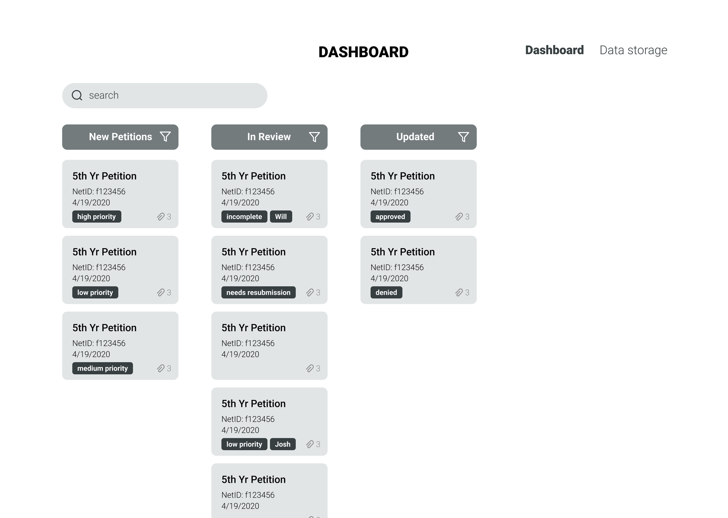
Dashboard
*
Dashboard *
Dashboard Registrar Needs
Registrar needs to view petitions in an organized manner
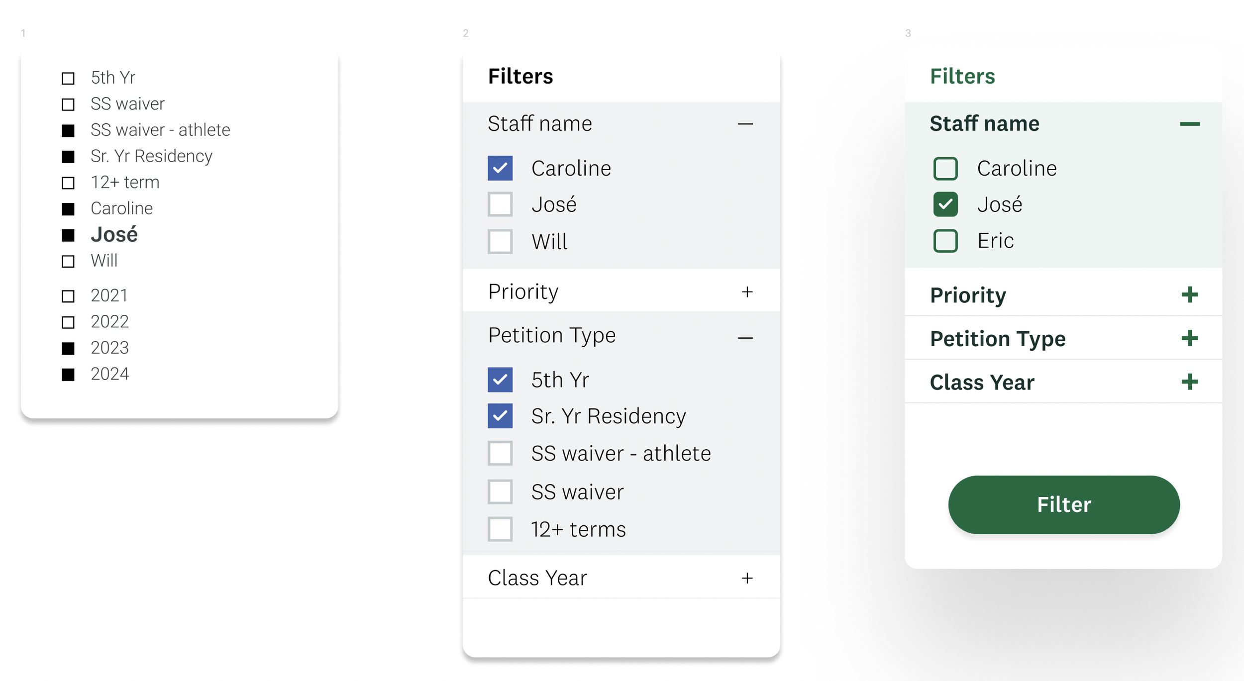
Registrar needs to filter / sort petitions as they wish
Registrar needs an easy access to closed petitions
1
Dashboard - Experimenting with layouts
2
Horizontal layout was more preferred as it flows naturally
Card style is not very valuable as it cannot be moved around
3⭐️
Clarity - Only see one category at a time
Control - Ability to filter petitions
Systematic workflow - Spreadsheet-like style provides better organization of petition components
Trello like column layout
Petition cards
Too much white space left on the screen
Initial design
Dashboard - Building on the layout
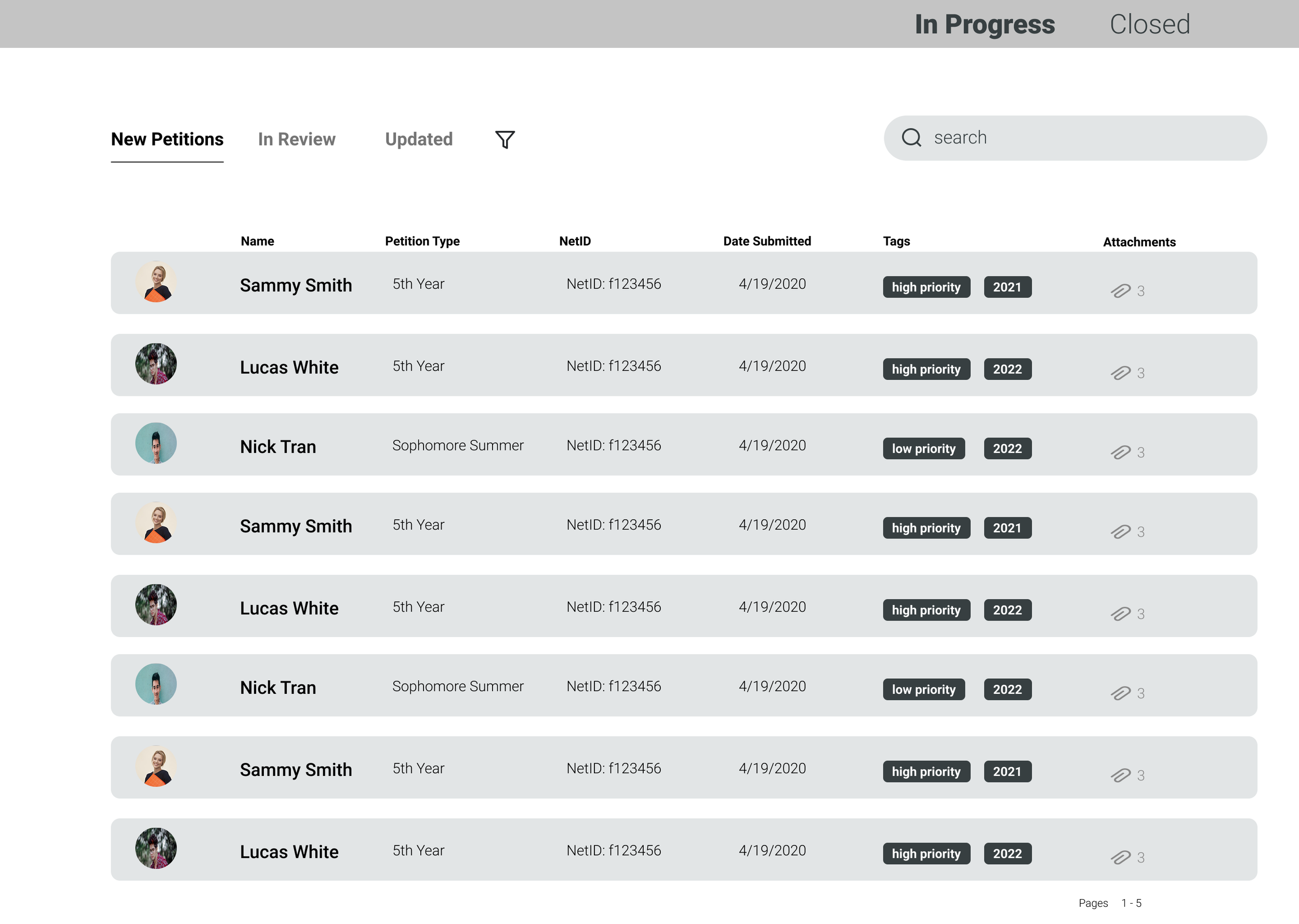
Revised design
Created columns for “Class Year” and “Priority” instead of tags
Replaced “Attachments” column with “Registrar name”
Users wanted a better organization for the “Tags”
Users said seeing the number of attachments is useless
Users want a clear way of claiming a petition and seeing the owner
➡️
Revised design
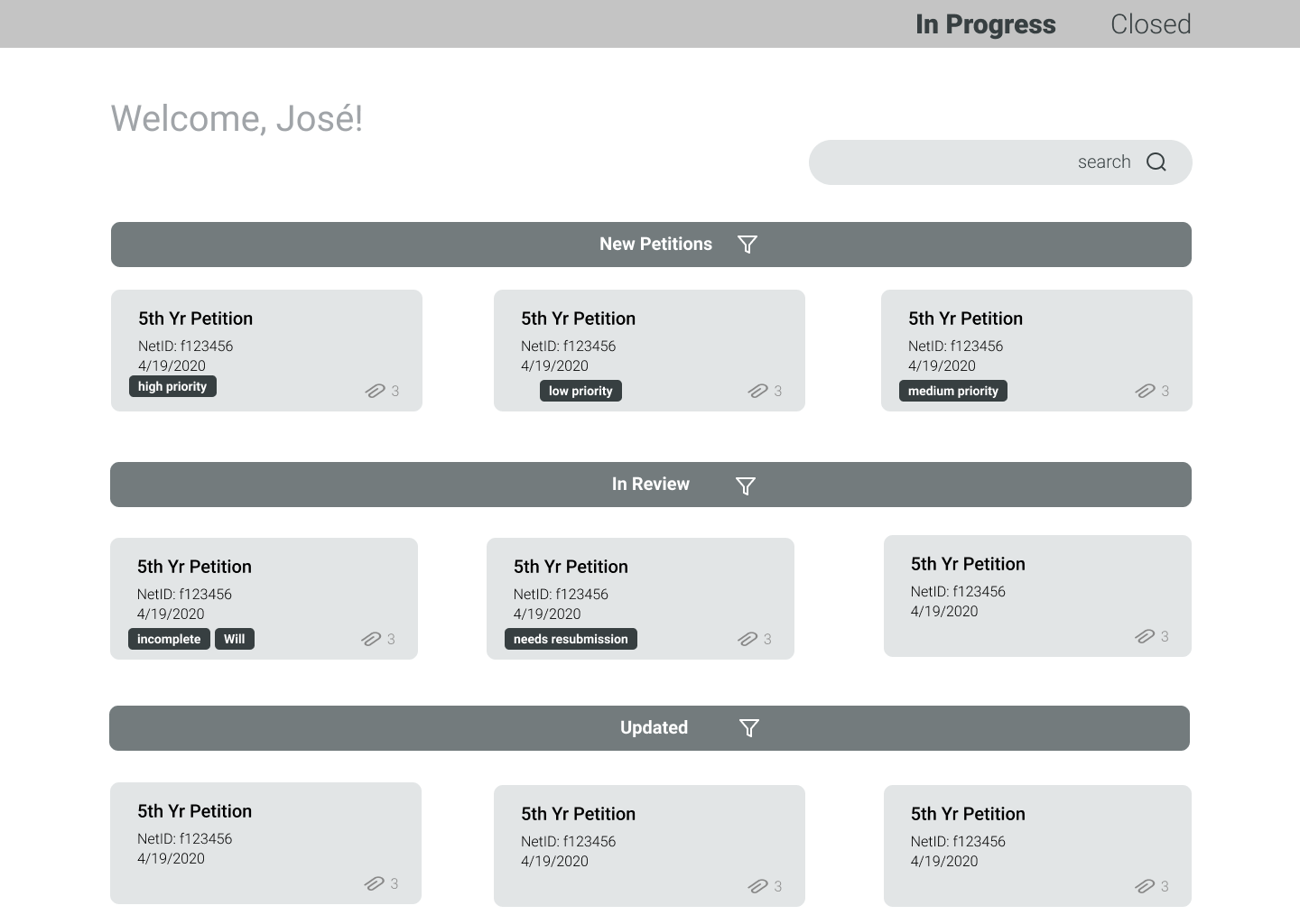
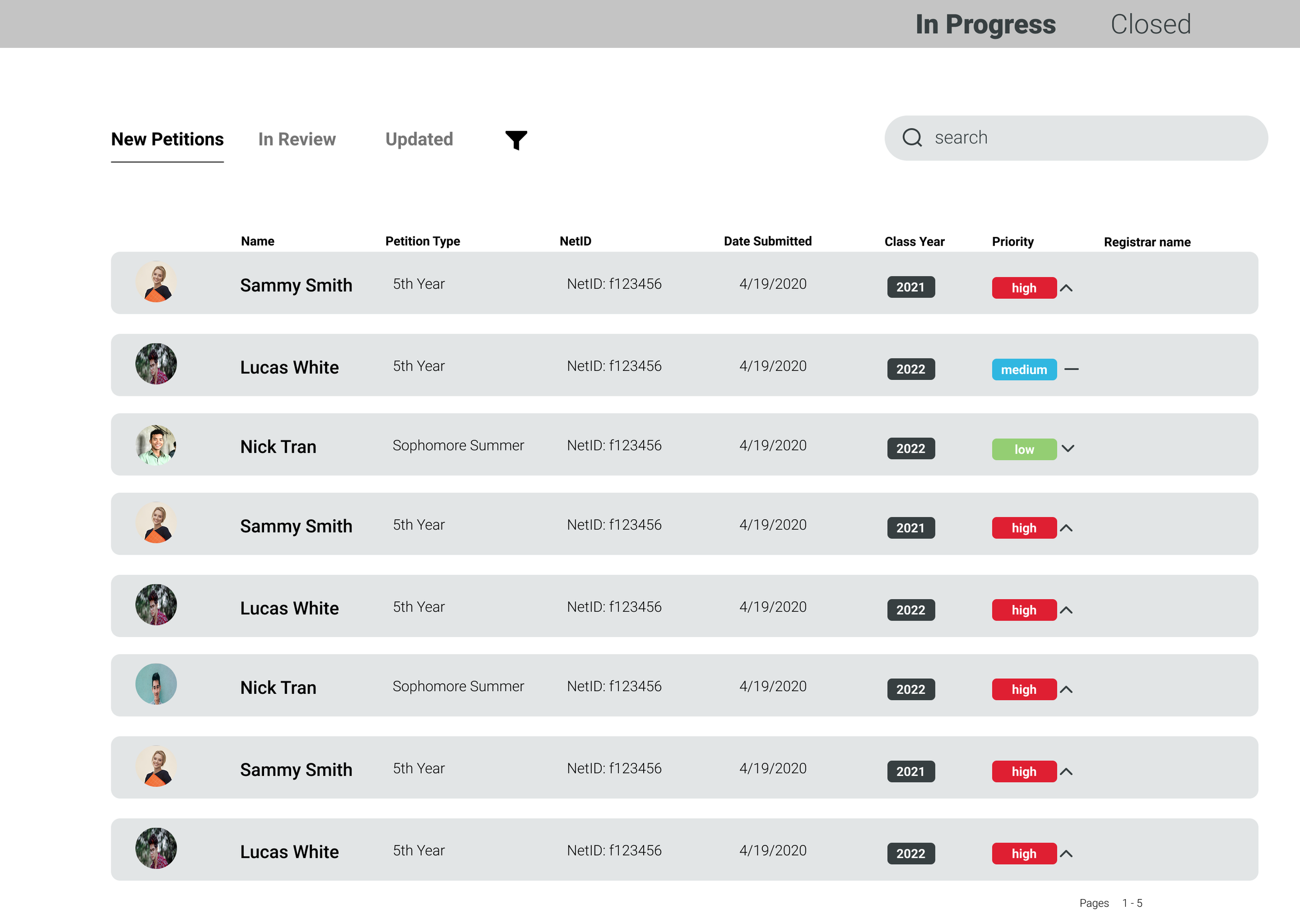
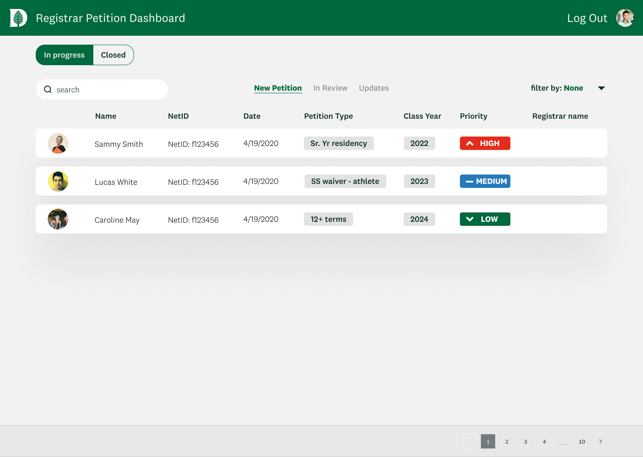
Dashboard - Transitioning into Hi-Fis
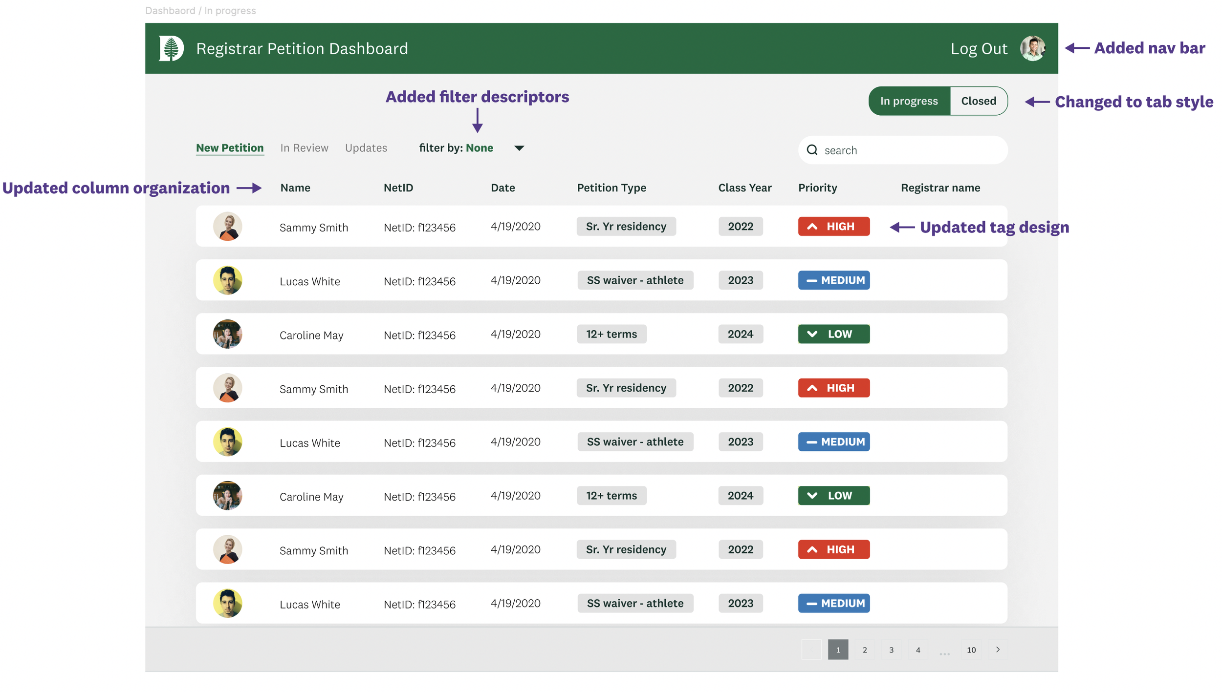
Higher Fidelity

Applied Dartmouth style guide and added a nav bar.
Moved “Petition Type” next to related petition details for better grouping.
Changed “In Progress” and “Closed” selection into a tab-style.
Users wanted to see relevant information closer together
➡️
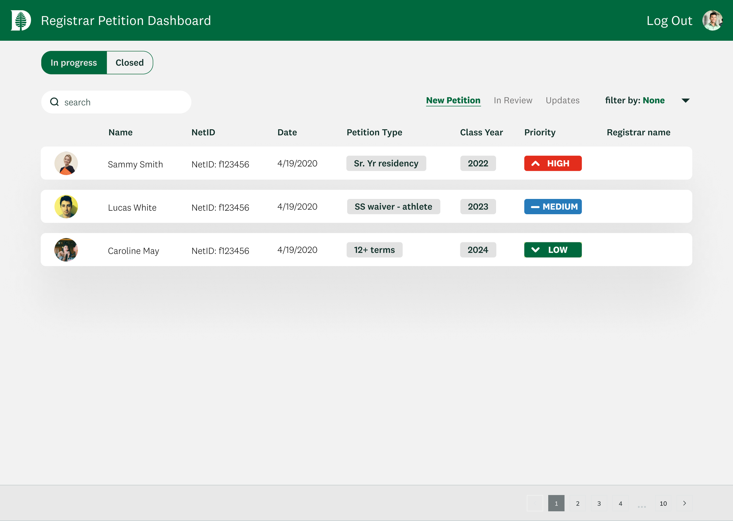
Dashboard - Transitioning into Hi-Fis
1⭐️
Dashboard - Des crit sessions
We tested different layouts for the petition type, search bar, and filter.
Designers unanimously preferred the search bar being on the right as it feels familiar
Highlighted how this layout supports a natural way of processing information
2
3
Higher Fidelity
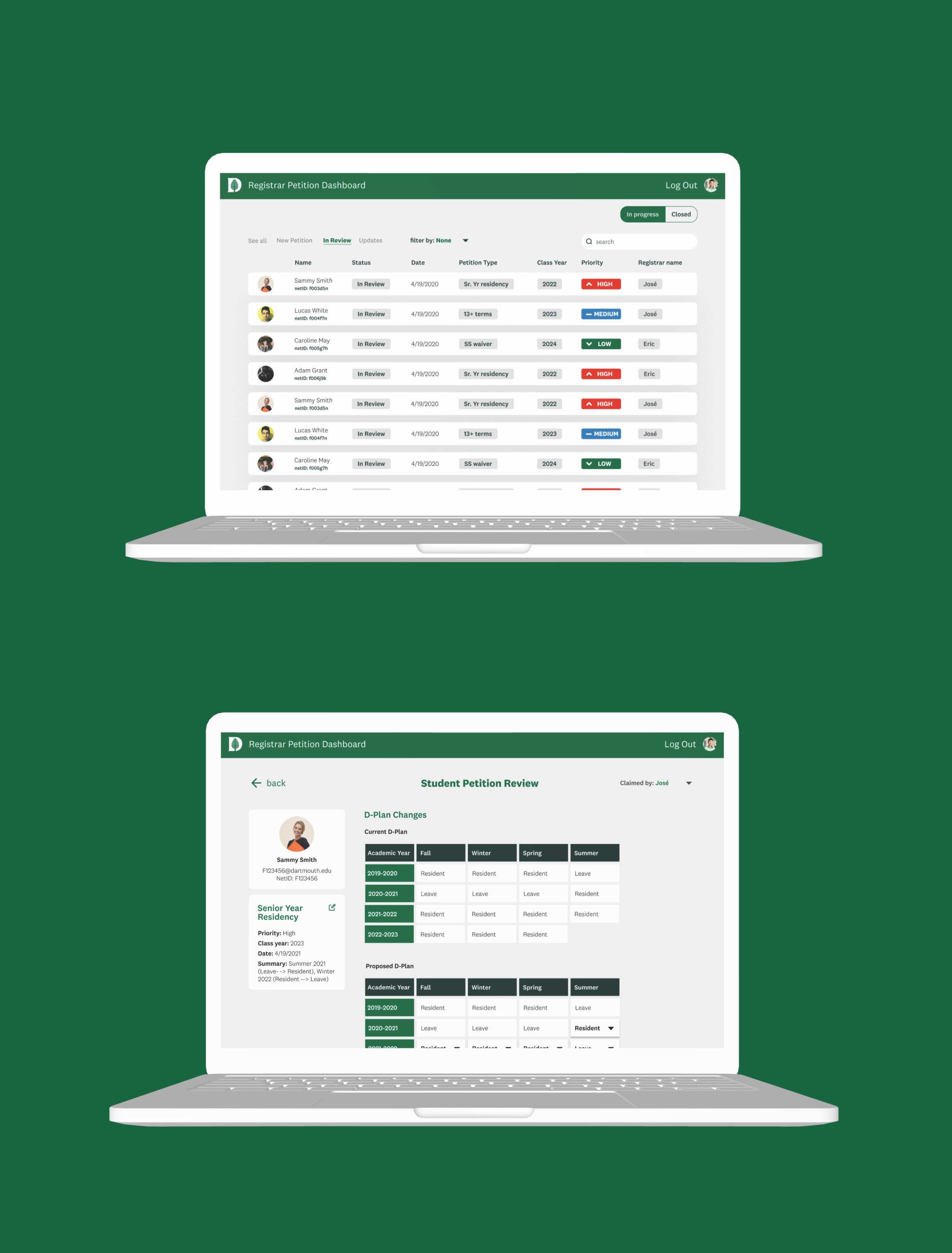
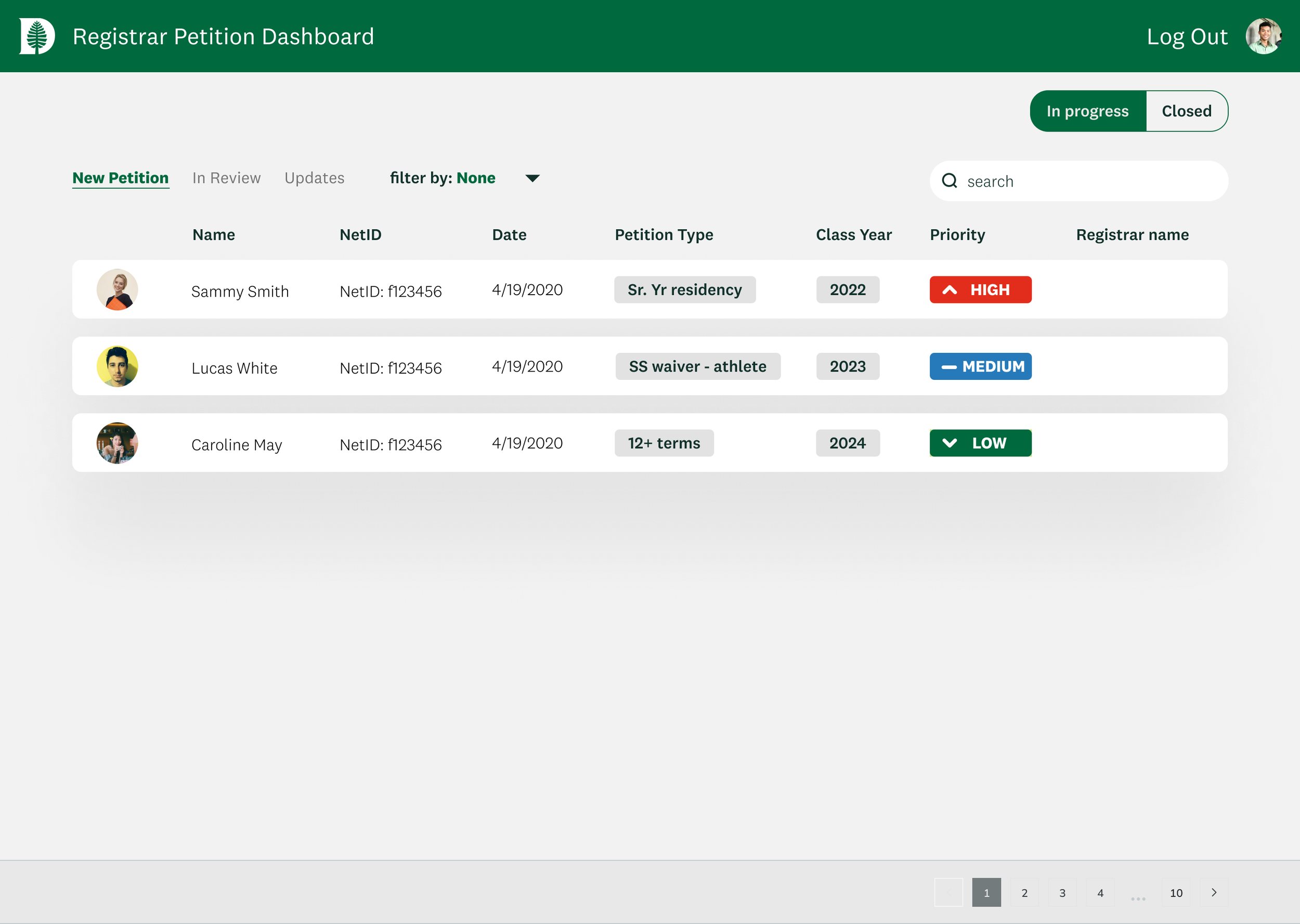
Dashboard - Final changes
Final Design
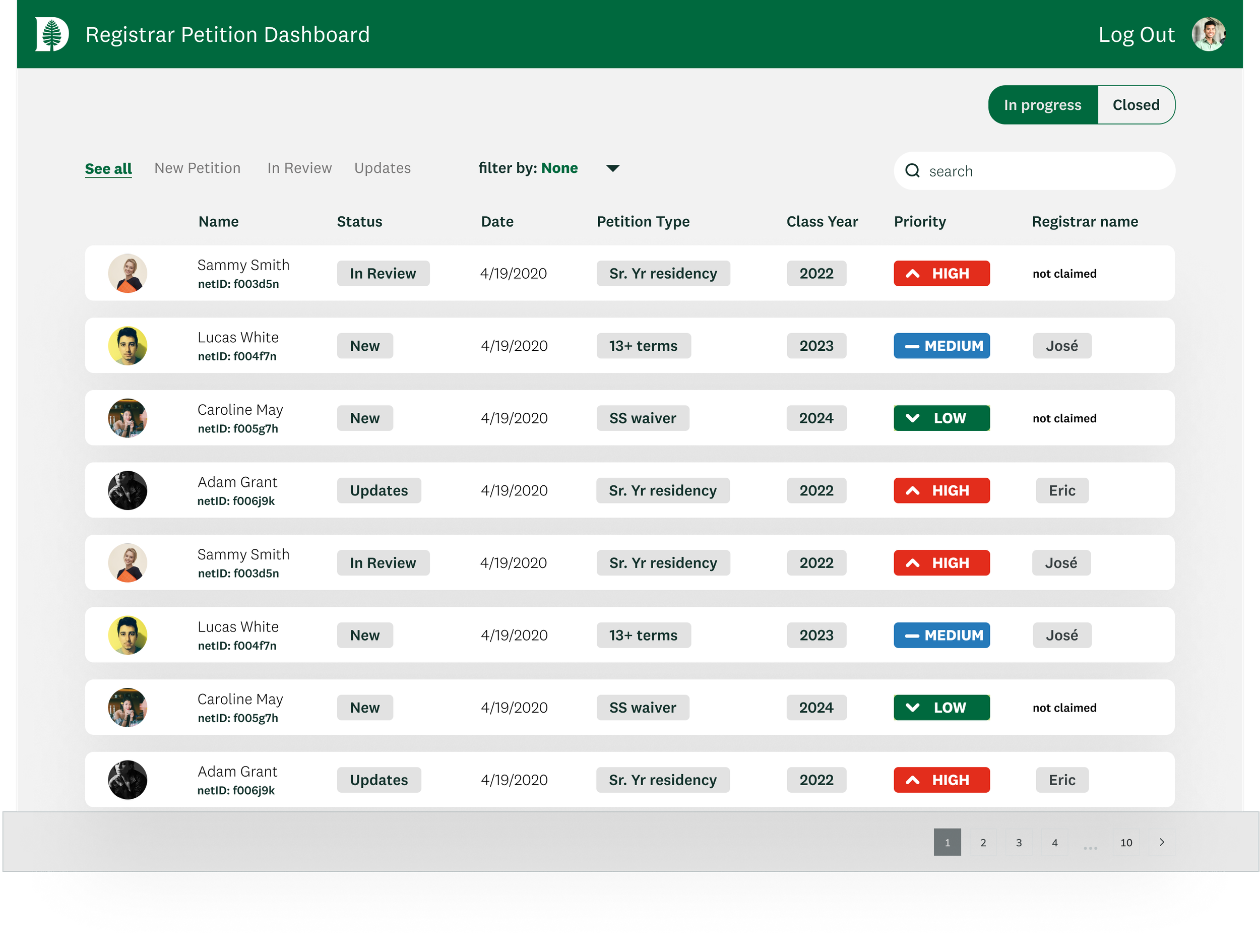
Added “See all” option.
Made it clear if the petition has not bee claimed.
Users want to see all petitions assigned to them at once.
➡️
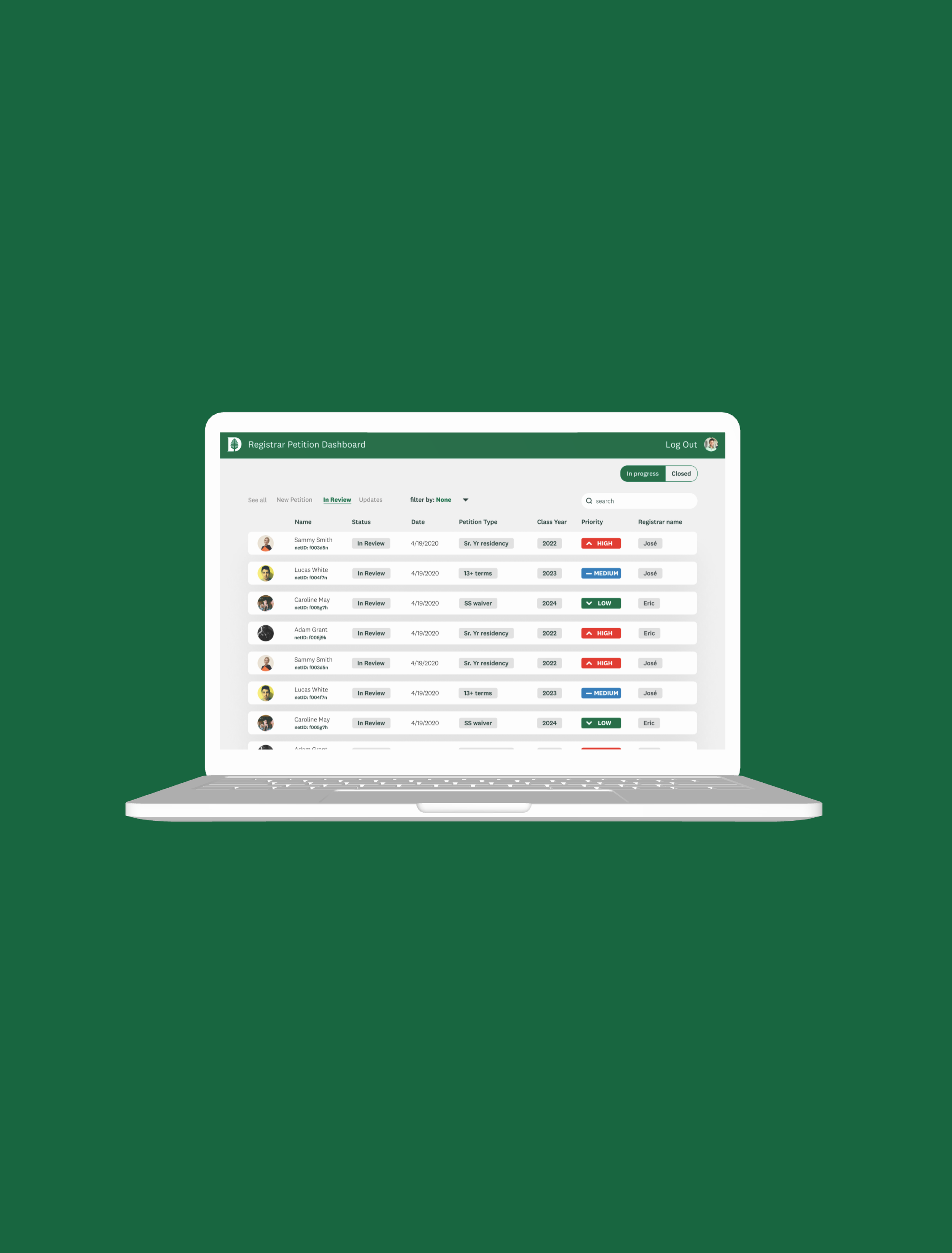
Dashboard - Final design
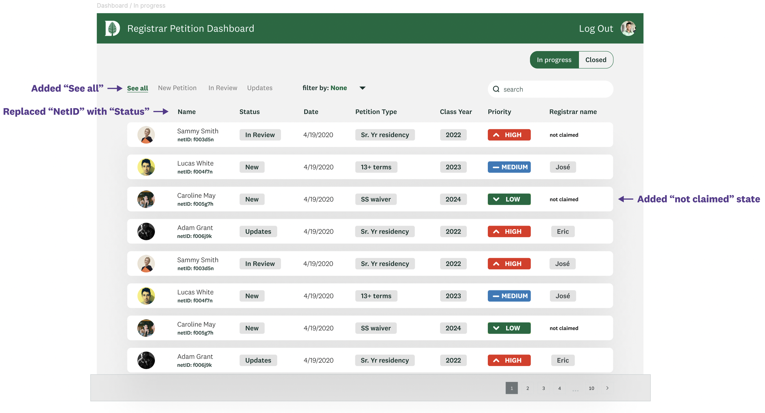
Tying it back to the design strategies…
Organzied dashboard reduces registrar’s mental load - systematic workflows
Status at a glance - clarity over complexity
Clean, modern design with sort/filter capabilities - control & confidence
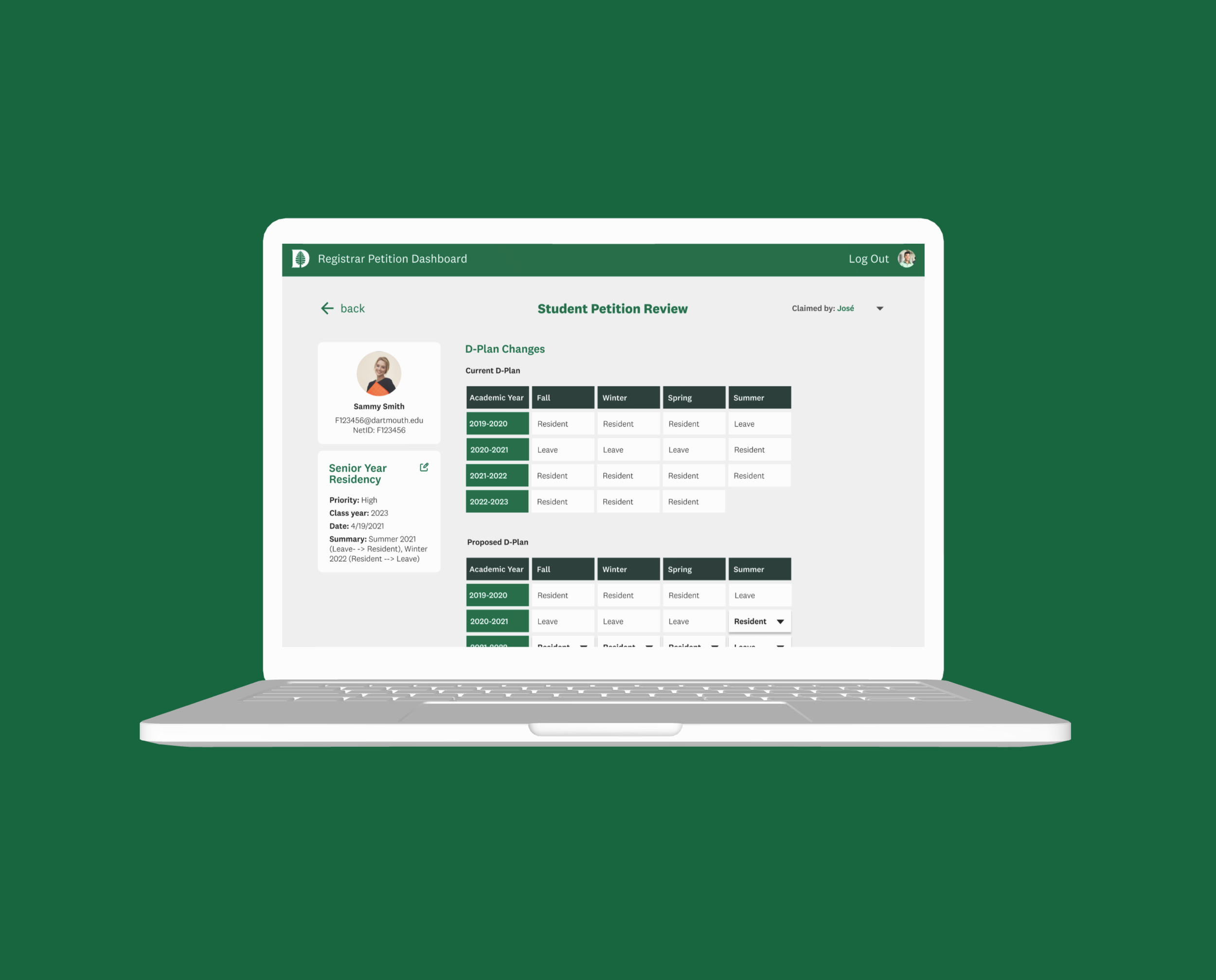
Petition Vew
*
Petition Vew *
Petition View Registrar Needs
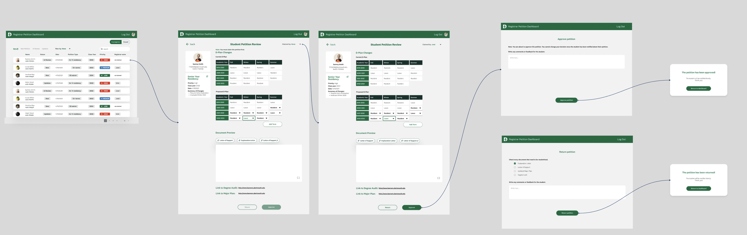
Registrar needs to view student info
Registrar needs to claim a petition
Registrar needs to easily understand the proposed change
Registrar needs to view all submitted documents
Registrar needs to make changes to petition if needed
Registrar needs to make a decision
Petition View - Experimenting with layouts

User Testing Takeaways
Testers thought 1 had too much white space
No real need to add tags at this point
Major plan is taking too much space and it is not always needed - can be an attached document
The proposed change is still not clear enough
Missing the ability to claim the petition
1
2⭐️
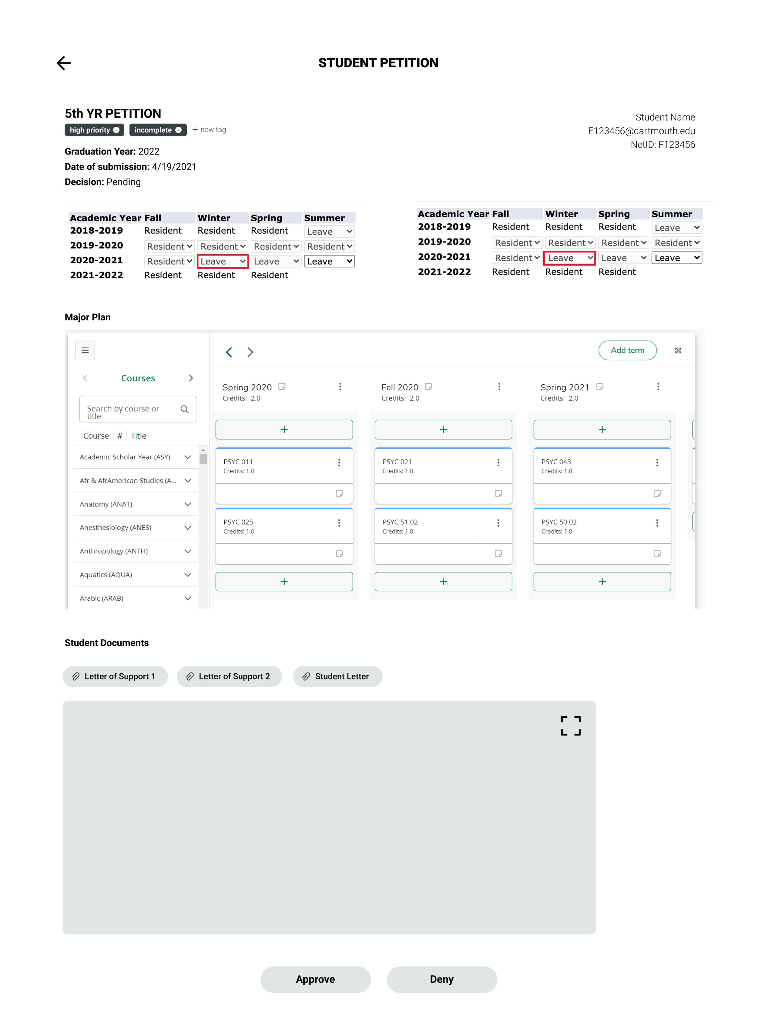
Petition View - More revisions
Mid Fidelity
➡️
Higher Fidelity
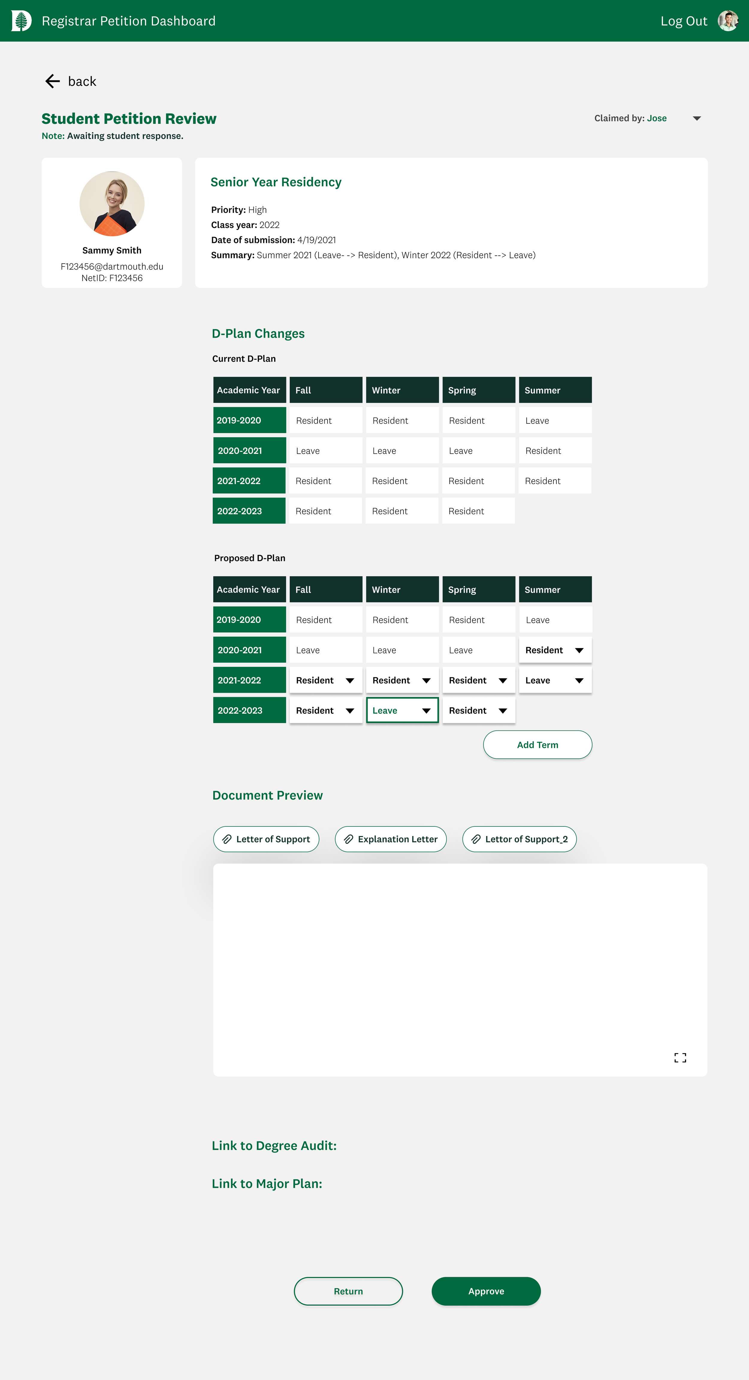
Added “Claimed by” status
Added “Summary” section
Replaced the major plan section with links directing to the necessary info
Applied Dartmouth style guide.
Transitioned back to this layout as users requested the student information be always visible as they are scrolling through the petition.
Added hover states to the plan components to make it appear editable.
Petition View - Final changes
Higher Fidelity
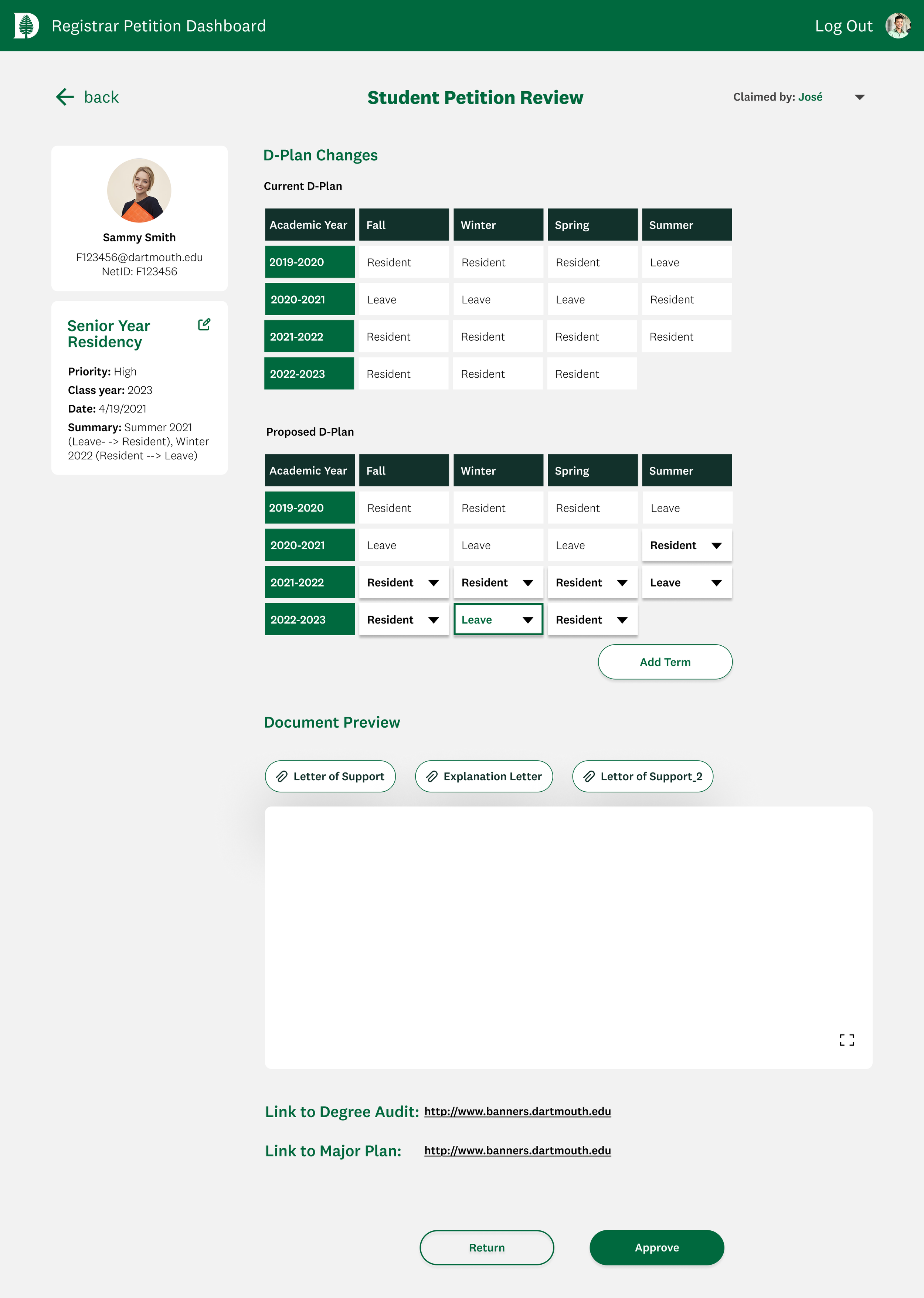
➡️
Final Design
Petition View - Final design
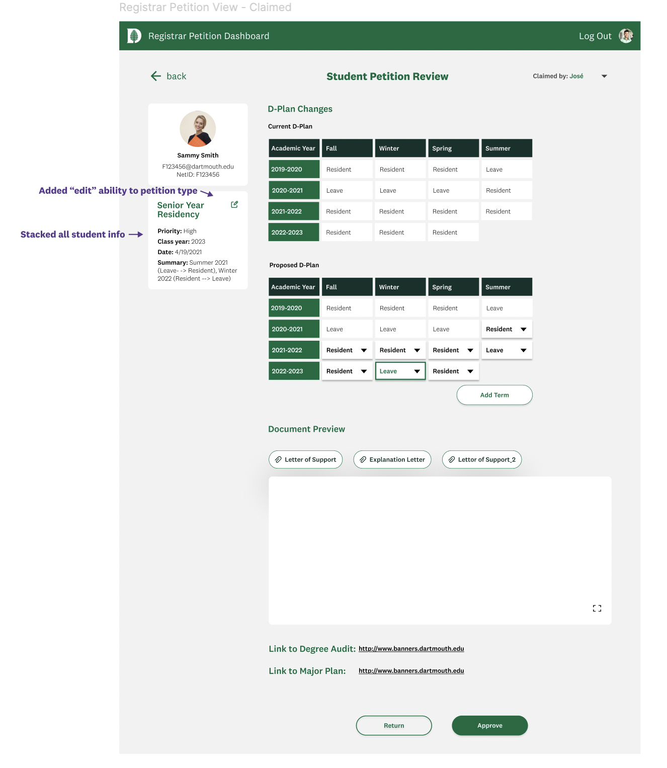
Tying it back to the design strategies…
Consistent petitons formats - systematic workflows
Hierarchical layout (summary → details)- clarity over complexity
Ability to edit petition components - control & confidence
Other Highlights
*
Other Highlights *
Filter - Revisions
Registrar User Flow
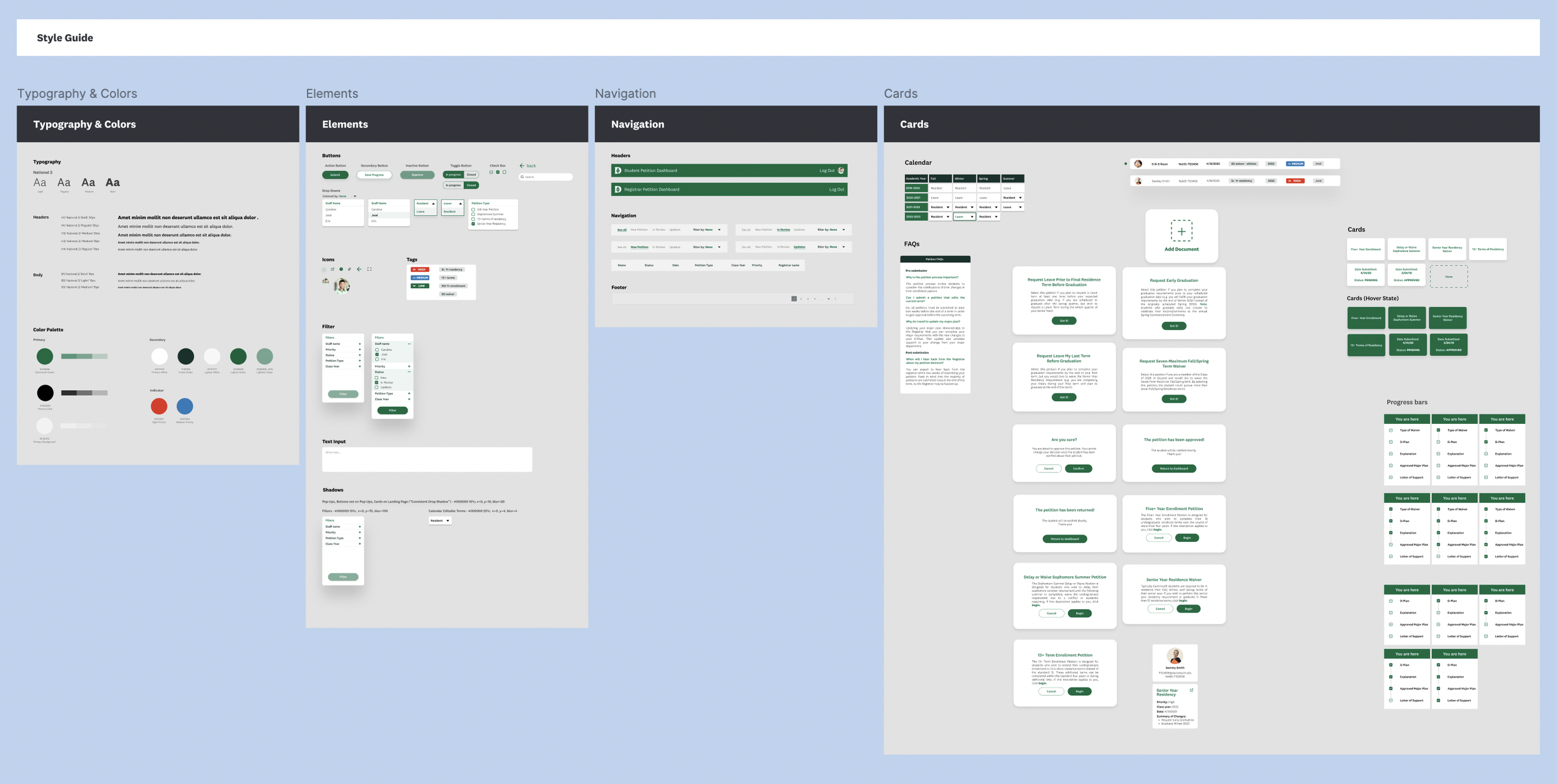
Style Guide
What People Are Saying…
“I feel like I finally have all the information I need in one place to make a confident decision.”
— Jose Sinclair
“I like having everything centralized, and I feel in control of finding, reviewing, and approving petitions.”
— Eric Parsons
“We’re used to working in clunky systems - this feels clean, modern, and much easier on the eyes.”
— Catherine Woodard
“It is empowering to know I can really support students with their requests.”
— Delia Mauceli
Outcomes & Impact
Reduced registrar cognitive load with structured submissions
Provided single source of truth per student
Simplified communication and tracking
Laid groundwork for future integration with DartHub
Reduced follow-up emails by ~30%
Review time cut from a 3-4 days to 1-2 days
Most importantly, registrars reported feeling more in control and less overwhelmed, which ultimately sped up decisions for students.
Reflection
Learned to design for back-office staff, a user group often overlooked
Balanced efficiency with registrar judgment in workflows
Emphasized craft and fidelity to make the tool not just functional but confidence-building
Partnered closely with registrars, PMs, and engineers to ensure the solution balanced usability and technical feasibility.
Key takeaway: registrar experience directly improves student outcomes