Unifying Implant and Restoration Planning in YomiPlan: A Seamless Smile Design Experience
Designing an intuitive restorative platform within YomiPlan to empower clinicians with a crown-down planning workflow—all in one software.
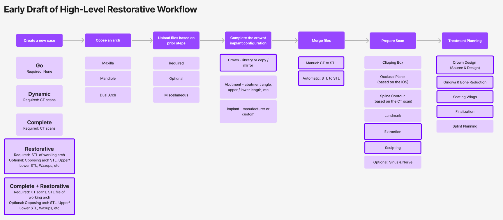
Project Overview
Background
“YomiPlan” is the planning software component of the Yomi dental surgical robot by Neocis. We identified a major opportunity to evolve the software by integrating restorative planning.
Problem Statement
Clinicians were forced to toggle between YomiPlan and third-party CAD software (e.g., Exocad, 3Shape) to complete a full implant case. This fragmented workflow introduced inefficiencies, risk of error, and compromised surgical-restorative alignment.
Project Goal
Design a flexible, intuitive smile design interface within YomiPlan that empowers clinicians to complete both surgical and aesthetic planning in a unified, efficient workflow.
My Role & Timeline
I led UX/UI design across research, prototyping, testing, and handoff, working closely with product managers, engineers, and clinical folks. The project ran over two years and launched to 250+ Yomi robot customers.
Result
Designed an innovative and intuitive platform that unified the implant and restorative workflow into a single, seamless experience
Achieved ~30% reduction in planning and procedure time, based on early user data
Drove increased adoption among general practitioners through a simplified, user-friendly interface
Launched the first CT-based restorative workflow that eliminates the need for a separate model scan
Research & Discovery
User Research Methods
In-depth interviews with oral surgeons, general dentists, and dental lab technicians
Observation of live and simulated implant planning and restorative design sessions
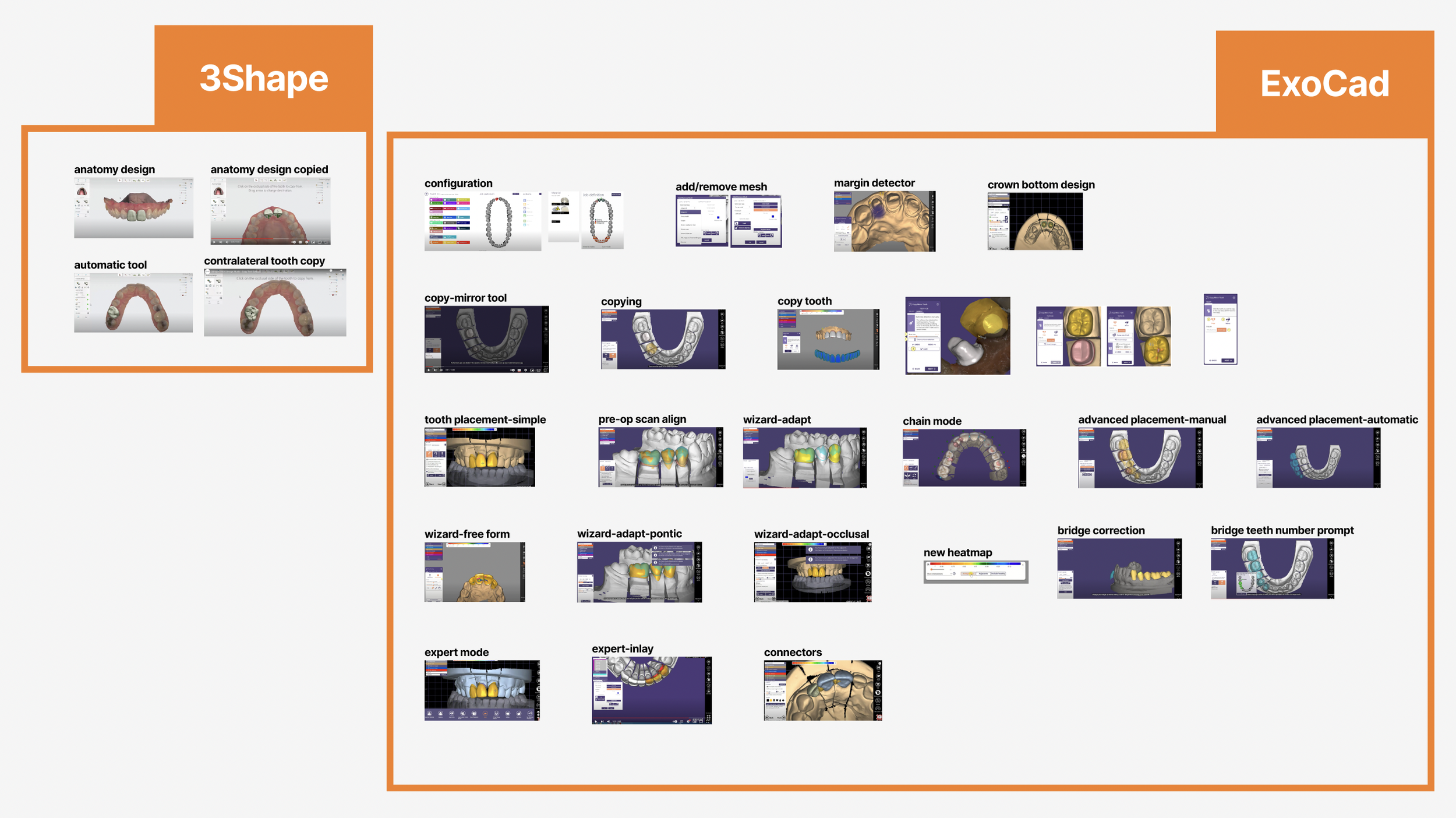
Competitive benchmarking (ExoCad, 3Shape, Cerec, etc)
Analysis of case reports, voice-of-customer feedback, and system logs
What We Learned from Users
-
Fragmented Surgical & Aesthetic Planning
Clinicians couldn’t plan implant and crown in one software—causing misalignment, errors, and wasted time.
→ How might we enable clinicians to plan crown-down cases in one platform? -
Rigid, Prescriptive CAD Tools
Existing platforms often forced linear workflows, punishing users for changes later in the process.
→ How might we offer flexibility without sacrificing guidance? -
Too Complex for General Practitioners
Most tools overwhelm GPs with features meant for lab techs.
→ How might we offer just enough functionality to support confident, temporary restorations?
Key Users We Designed For
-
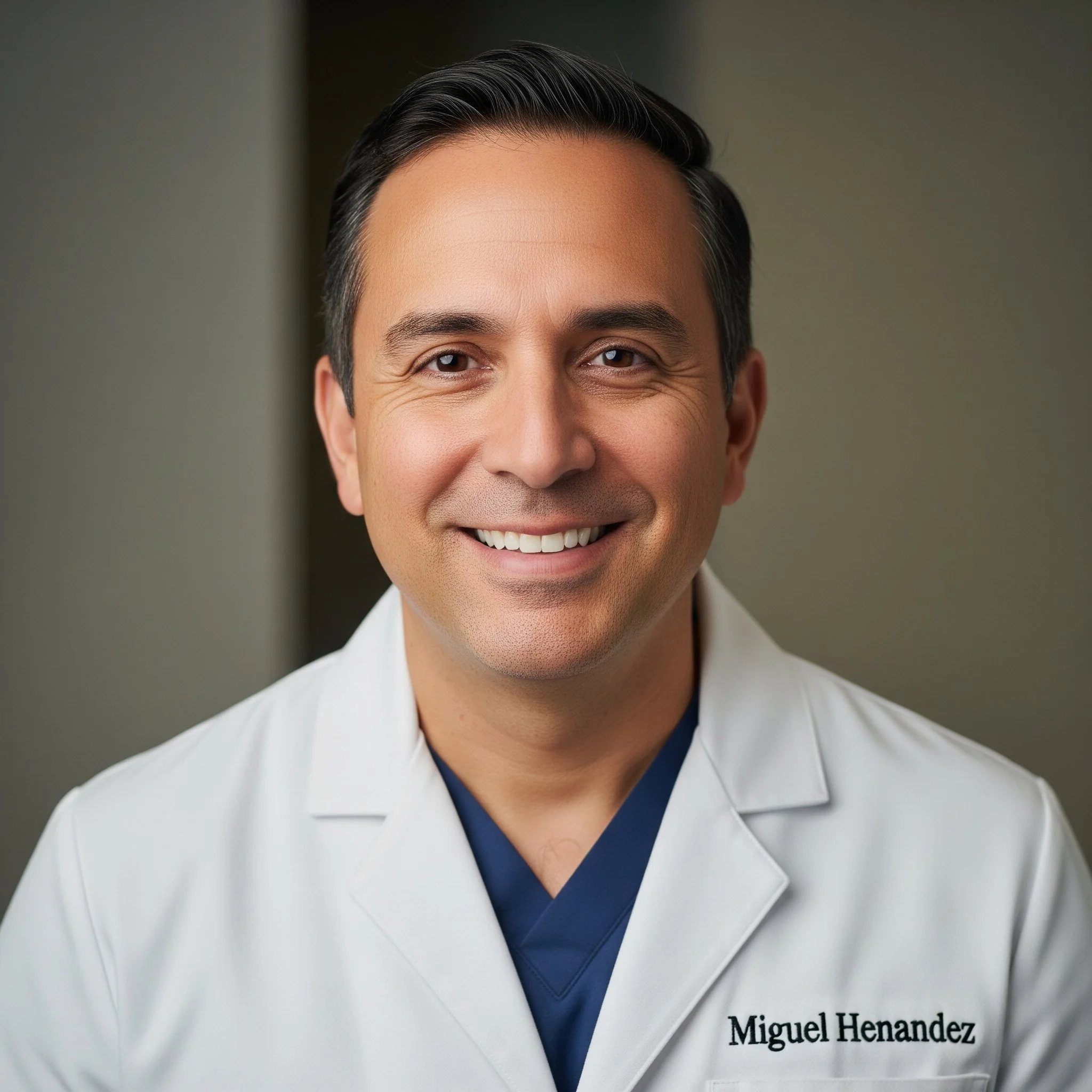
Dr. Miguel Hernandez
Oral & Maxillofacial Surgeon
15+ years of experience
Goals:
• Bring restoration design in-house
• Reduce lab turnaround time
Pain Points:
• Fragmented workflows across platforms
• Complex CAD tools not scalable for staffNeeds:
• Integrated tools within YomiPlan
• Flexible design flow for lab team
• Reliable, intuitive interface for complex cases -
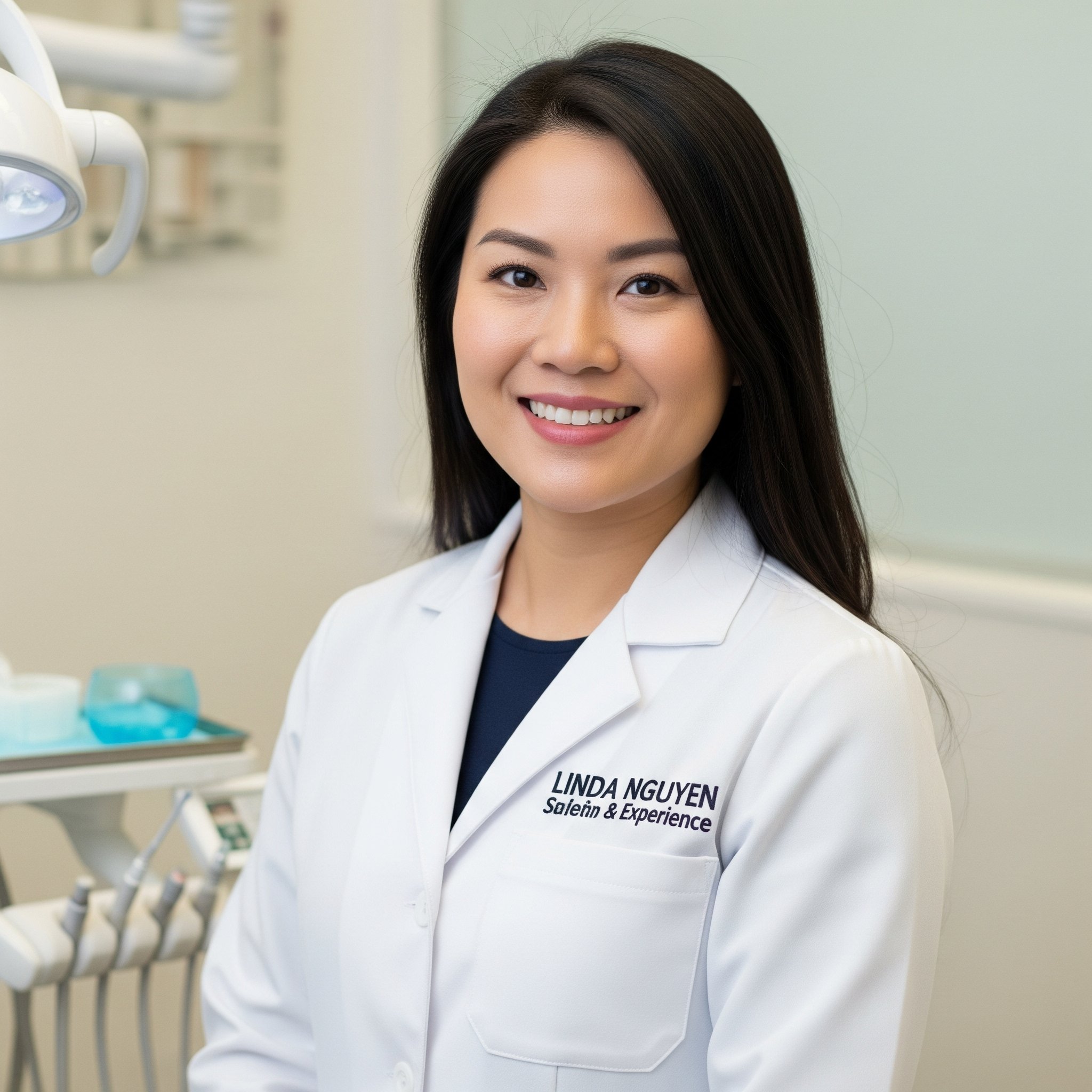
Dr. Linda Nguyen
General Practitioner
7 years of experience
Goals:
• Improve esthetics of provisional crowns
• Gain confidence in digital workflowsPain Points:
• Overwhelming CAD software
• Limited control over lab outputNeeds:
• Simple, guided tools within YomiPlan
• Ability to iterate easily without penalty
• Visual feedback on margin, occlusion, esthetics -
Alex Rivera
Dental Lab Technician
10 years of experience (in-office and remote lab)
Goals:
• Support surgeons with clean, accurate restorations
• Streamline data handoffs and minimize manual cleanupPain Points:
• Receives incomplete or inconsistent planning data
• Must manually align data across systemsNeeds:
• Clear restorative exports directly from YomiPlan
• Fewer software workarounds or remakes
User Journey Update
This is an early example of user journey mapping. The bordered steps represent new additions to the existing workflow.
Our Design Strategy
Seamless integration
Use the existing surgical interface as a base to introduce restorative tools—zero extra learning curve for existing users.
CT-Model based design
Support restorative design directly from CT data—no physical model scanning required.
Flexible, non-linear workflow
Allow margin edits, crown changes, or gingival adjustments at any time without forcing restarts.
Unified planning context
Visually connect the restoration with implant position, bone, gingiva, and occlusion.
Minimum toolset, maximum value
Provide only what’s essential for temporary design, avoiding the complexity of full CAD systems.
Deep Dive: Crown Design Copy / Mirror Feature
Research Insights
Through research, we identified the importance of supporting copying and mirroring crowns for clinicians. Their core needs were:
Selecting a source crown to copy from
Adjusting or modifying that selection
Earlier mockup
Highlights
Source options: Copy, Mirror, or Library
Editing tools: Placement and Morph
“Ghost” crowns to represent missing crowns
Drag-and-drop functionality for copying crowns
User Testing Feedback
Users found “ghost” crowns confusing - hard to understand a crown being both present in the case yet missing.
Source selection was unclear, as sliders/toggles are conventionally associated with transparency control.
Drag-and-drop felt too manual and effortful.
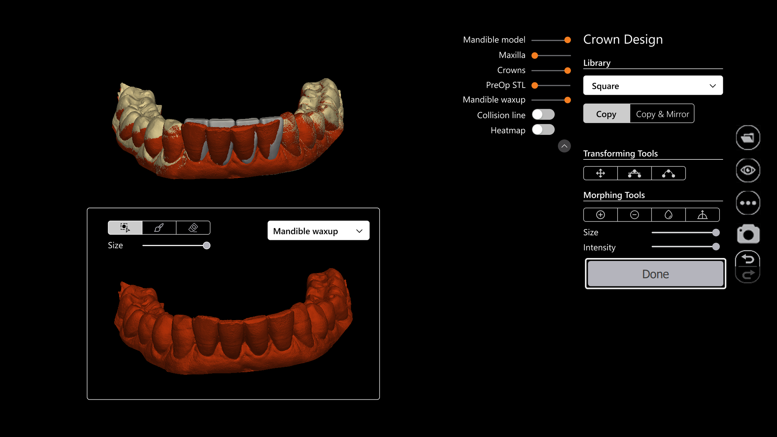
First Restorative Release Version
Due to technical and timeline constraints, the Copy/Mirror feature was deferred to V2.
V1 only supported library crowns (square, neutral, old).
The focus shifted to building out transformation and morphing tools.
Copy / Mirror - Experimenting With Layouts
-
![]()
PIP view
- Having interactive tools scattered across the UI felt unintuitive.
- The process for selecting target and source crowns lacked clarity.
-
![]()
Context-Menu
- Users preferred a more visual approach to selecting the source crown.
- Inconsistent behavior within the context menu caused confusion.
- Limited options in the menu felt restrictive and overly prescriptive.
-
![]()
A separate step
- While the step-based flow created a cleaner UI, users noted they often switch back and forth between copying and editing.
- Requiring toggling between steps felt inefficient and penalizing to their workflow.
Key Takeaways from Testing & Observation
Users prefer visual source selection methods.
Crown design tools need to be centralized but context-sensitive to avoid overwhelming the user.
Manual work should be minimized wherever possible.
Copy / Mirror- Continued
Highlights
Grouped source tools for easier discovery.
Added shortcuts for common actions.
Extended functionality of the object slider.
User Testing Feedback
Users were unclear on the expected sequence of actions.
Sliders for source selection created friction since they conflicted with existing mental models.
Having all tools together was appreciated, but some users worried about clutter and overload.
AI-Powered Improvements
In the second release of the Restorative module, we integrated an AI anatomical segmentation tool.
Its accuracy and efficiency unlocked new Copy/Mirror capabilities:
Automatic tooth selection with no manual adjustment required.
Accurate initial crown proposals based on user selection.
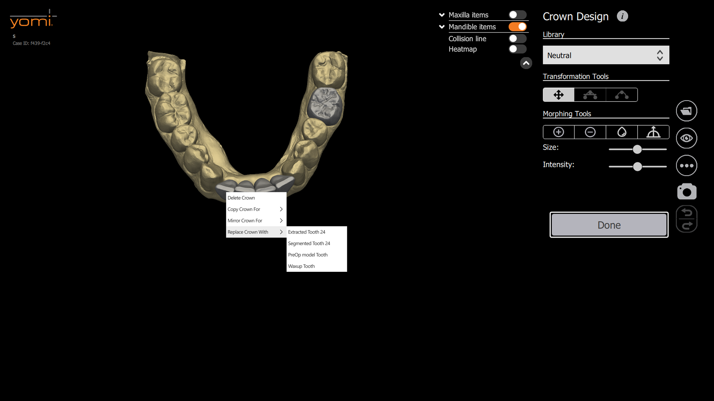
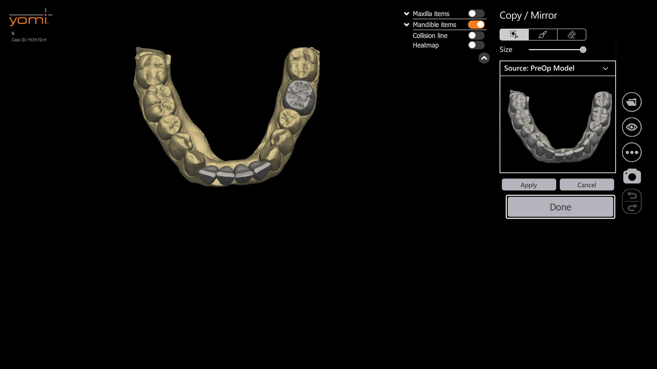
Copy / Mirror - Final Design
Crown proposals
Removed manual source segmentation tool.
Carefully-curated crown proposal logic.
Tooth map for target selection
Consistency with the prescription page for familiarity.
Intuitive user flow - target selection always first.
Retained 3D widget for crown placement.
Source & Design tabs
Driven by the regular crown design workflow.
Less clutter.
Familiar layouts.
Copy / Mirror – Validation & Evolution
Early designs (ghost crowns, sliders, drag/drop, source STL view) confused users and felt too manual.
Clinicians needed a clear, visual way to select source and target crowns.
The Challenge
User testing revealed pain points with metaphors (ghost crowns) and controls (sliders).
Dev collaboration ensured feasibility of auto-selection, PIP view, and tab grouping.
Iterated to streamline the flow: always target first, fewer manual steps, clear tool organization.
What We Did
Outcome (Pending FDA approval)
Clinicians validated the flow as intuitive and efficient.
Engineers confirmed technical soundness, reducing future rework.
Ready to deliver faster, more confident workflows once approved.
Final Design
Seamless integration with existing YomiPlan layouts (tooth map, design tools, prescription page).
Flexible / non-linear workflow through Source & Design tabs.
Minimum toolset, maximum value: AI-driven proposals + lightweight transformation tools.
Final Design Highlights - Bringing Everything Together
-
![]()
Streamlined Planning Workflow
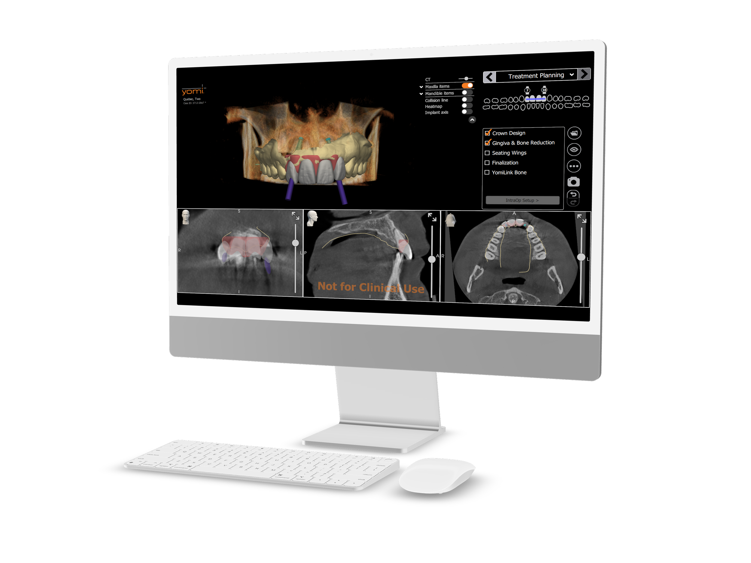
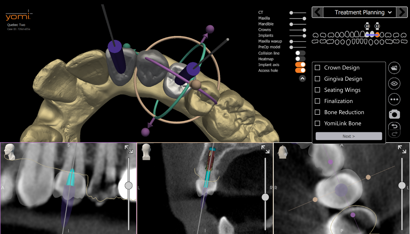
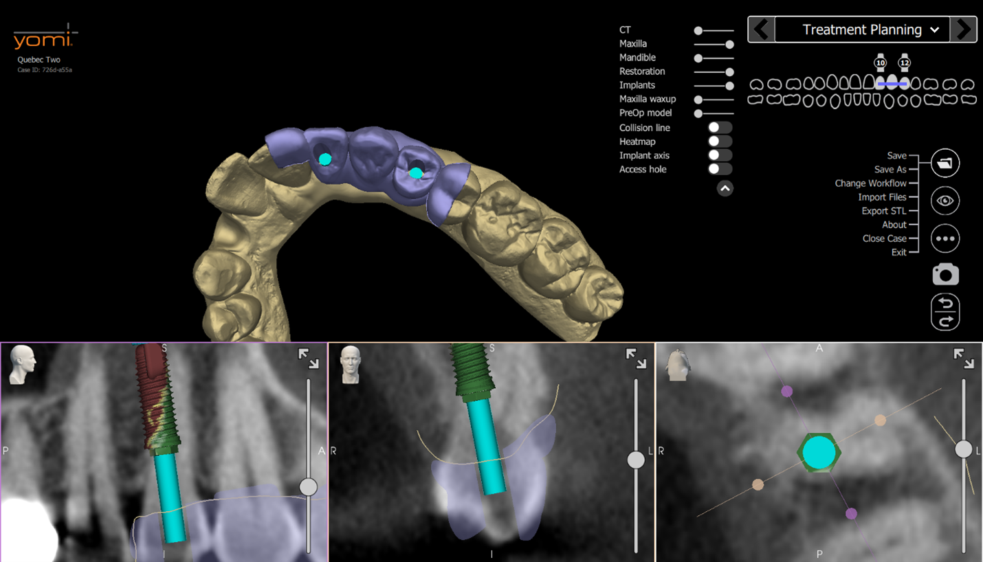
Users can seamlessly add manufacturer-specific implants, custom abutments, and either library-based or biocopy crowns to a case. Upon entering the Treatment Planning page, all components are automatically positioned on the arch relative to the occlusal plane and spline. Surgical and restorative objects are fully integrated, allowing users to visualize and modify the complete treatment plan within a single unified platform.
-
![]()
Precision Access Hole Visualization and Cutting
Based on the selected implant position and abutment, users can visualize and cut the access hole based on their implant planning. This feature enables minimal and precise hole sizing, improving both prosthetic predictability and retention by preserving material integrity.
-
![]()
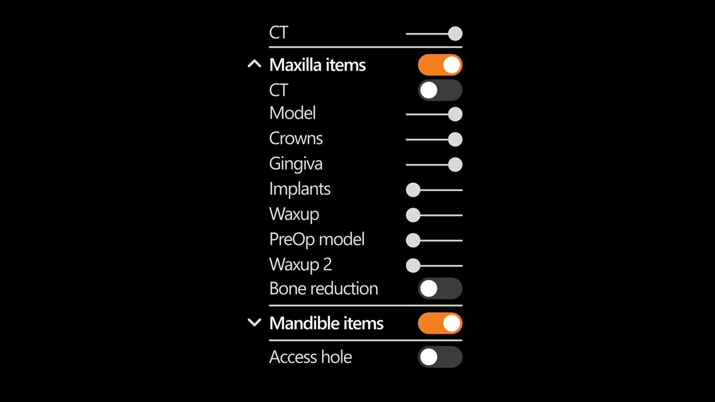
Dynamic Object Transparency Control
A global transparency slider gives users fine-tuned control over the visibility of individual case elements, including crowns, implants, abutments, access holes, intraoral scans, etc. This functionality enhances focus and clarity, allowing clinicians to isolate specific components for a more streamlined design and review process.
Final Design Highlights - Scan Preparation
-
![]()
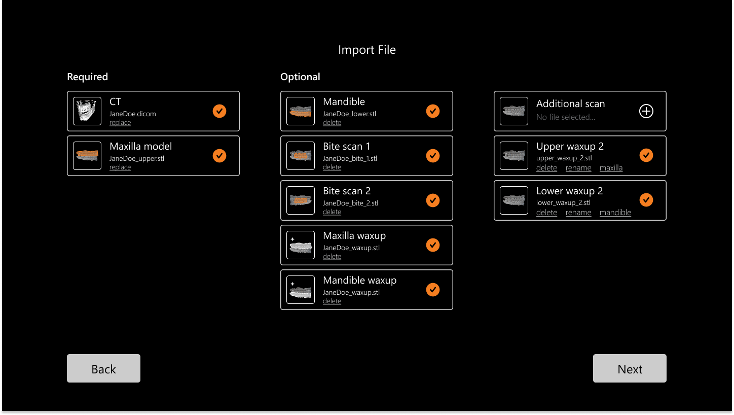
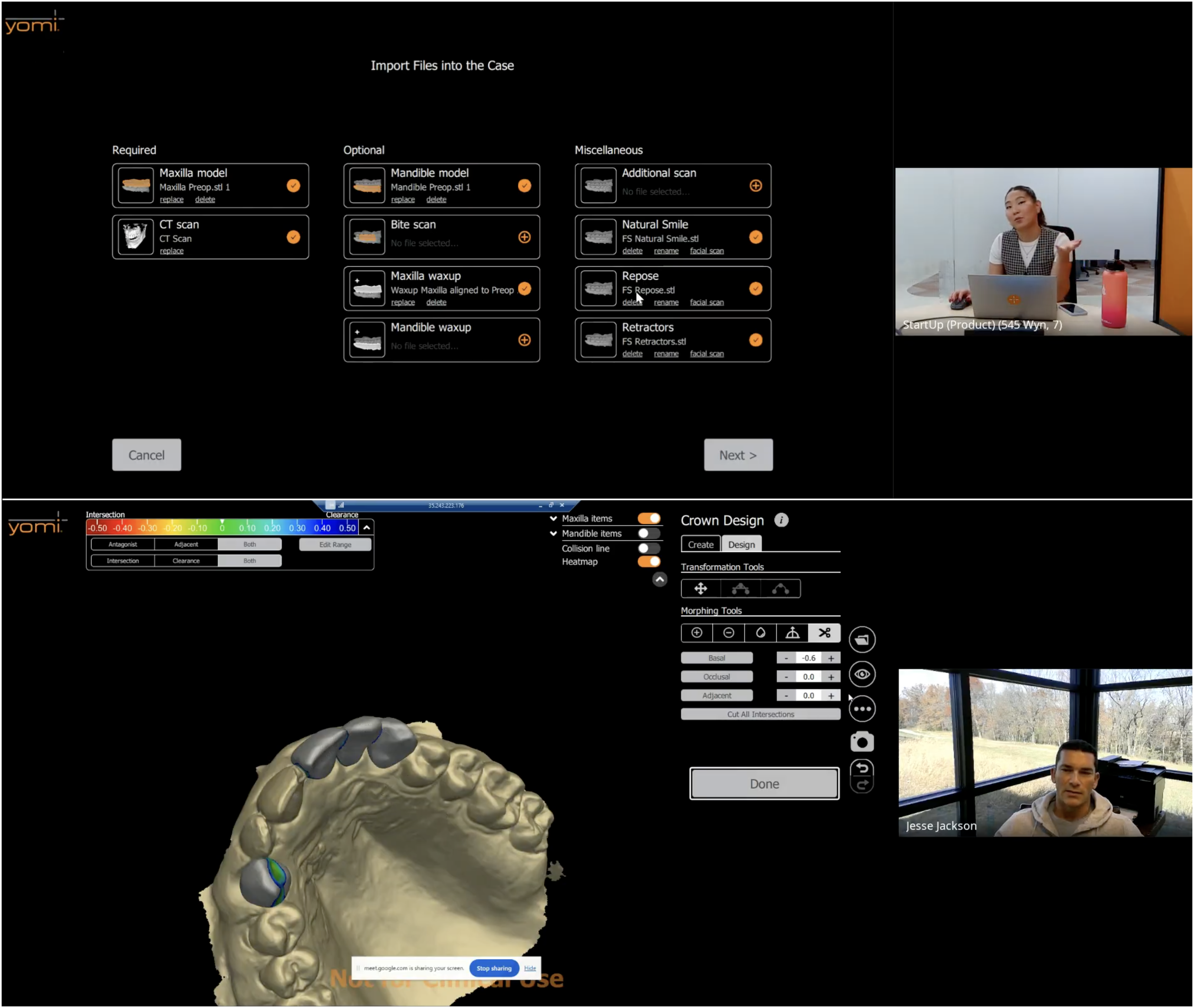
Flexible STL Importing
We enabled users to import an unlimited number of STL files, accommodating the wide variety of inputs clinicians rely on, such as wax-ups, face scans, opposing arches, and other custom scans. By removing restrictions on STL type or category, the software now supports a more realistic and comprehensive planning workflow.
-
![]()
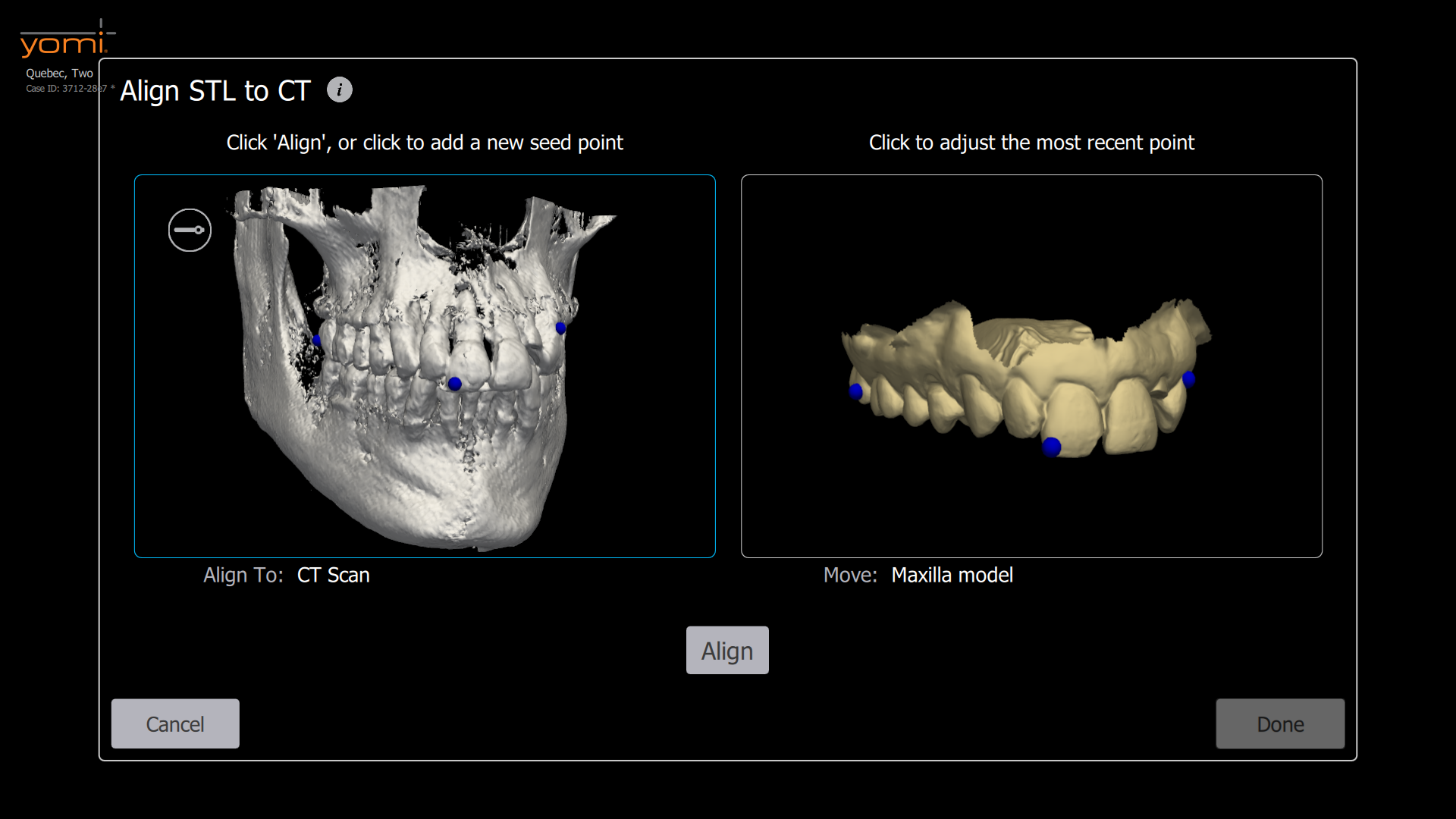
Automatic and Manual STL Alignment
To streamline the setup process, we introduced automatic STL alignment, which reduced manual input by approximately 80 percent while improving accuracy and reducing the likelihood of user error. For edge cases or advanced control, users can also perform manual alignment to fine tune results as needed.
-
![]()
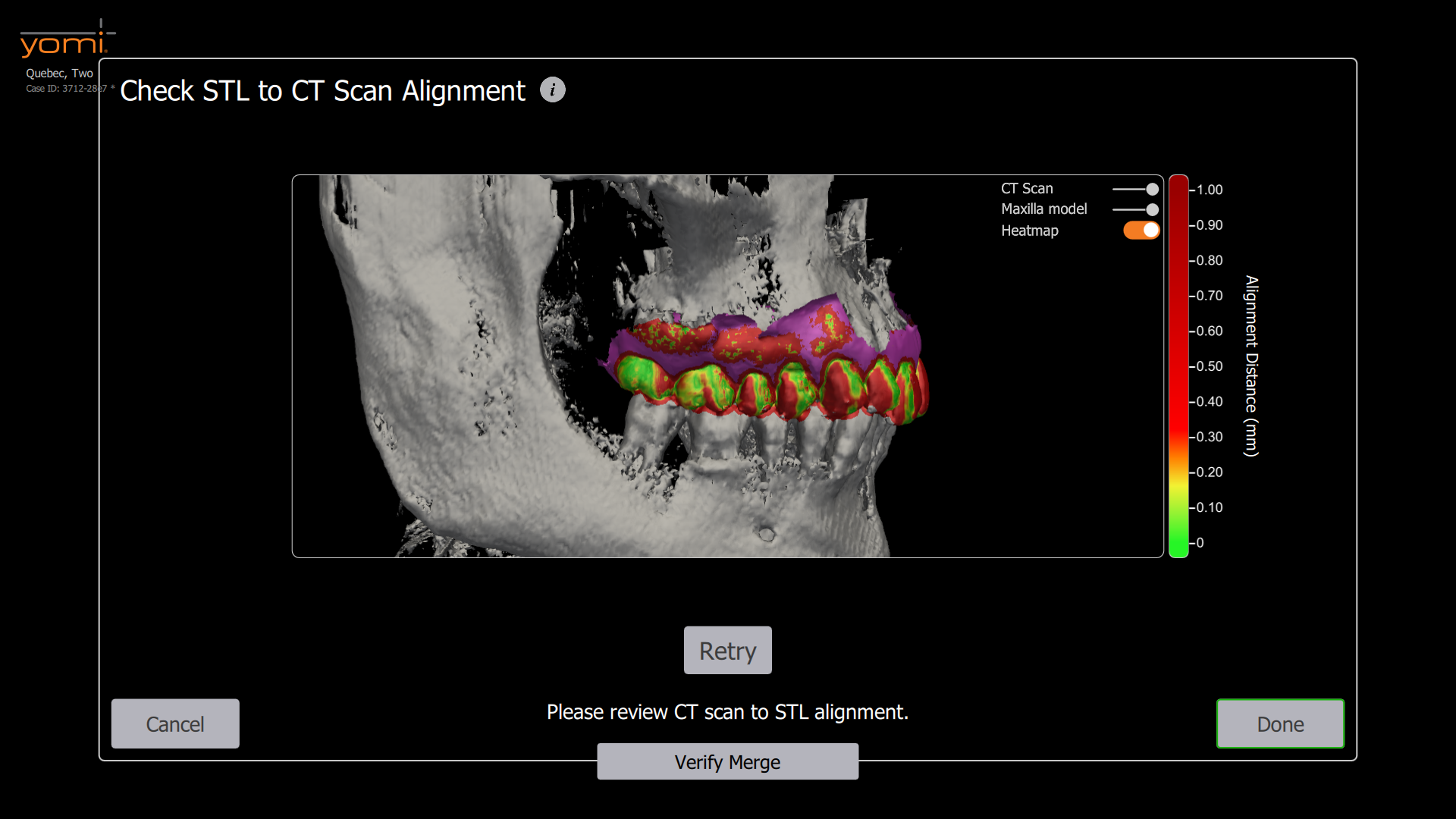
Visual Alignment Validation
To help users confidently assess the accuracy of alignments, we added a color coded heatmap that highlights surface deviations. This visual feedback makes it easy to identify and correct discrepancies early in the planning process.
-
![]()
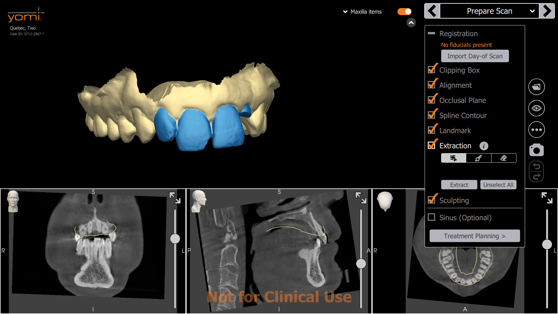
Digital Tooth Extraction and Sculpting from Preoperative IOS
This feature allows users to digitally extract teeth from the preoperative intraoral scan. By modifying the original surface, clinicians can create a clean base for designing restorations directly within the software, without needing a physical model or third-party tools.
Final Design Highlights - Crown Design
-
![]()
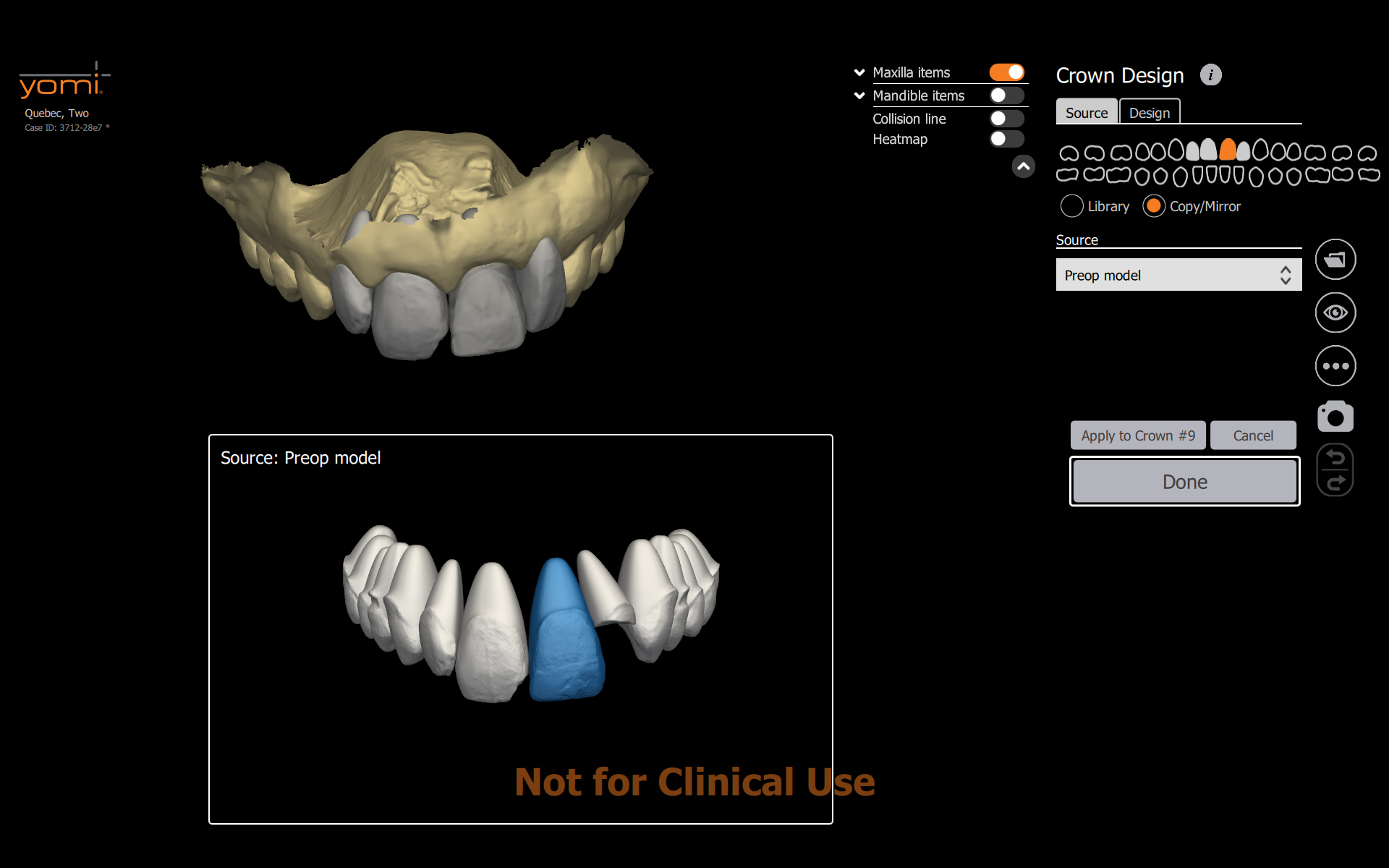
Customizable Crown Proposal Sources
Users can now select the source of the initial crown proposal, choosing from built-in crown libraries, existing dentition, or imported wax-ups. This flexibility supports a wide range of clinical workflows and ensures the proposal starts from a clinically relevant reference.
-
![]()
Intuitive Crown Editing Tools
With the ability to select, transform, and morph crowns directly in the workspace, clinicians can easily fine-tune each restoration. These streamlined tools make it possible to achieve precise results with minimal clicks, reducing both planning time and user frustration.
-
![]()
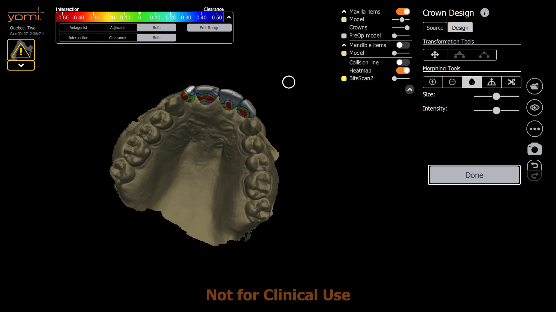
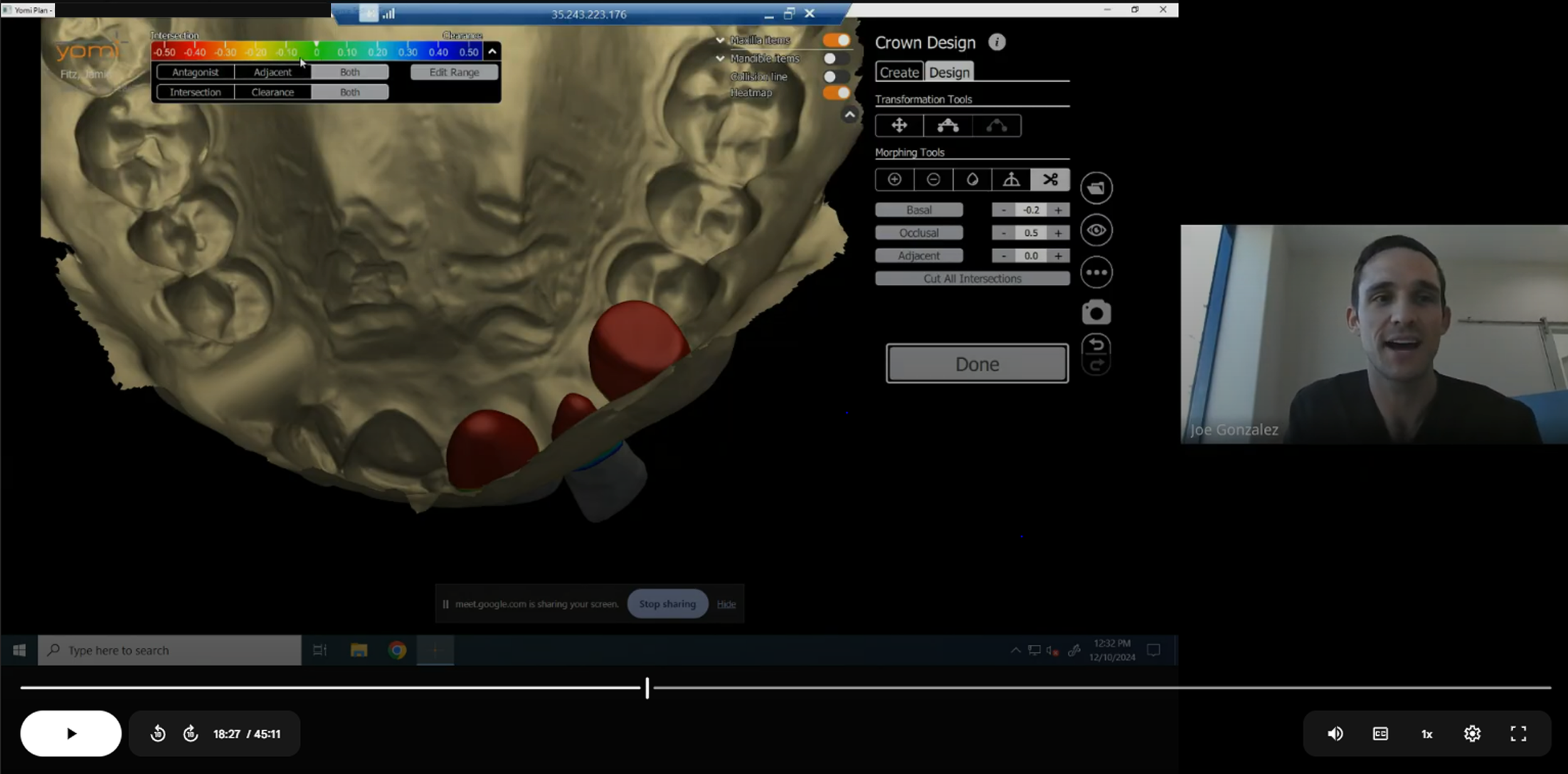
Real-Time Collision and Clearance Feedback
A visual heatmap and collision line overlay help users identify and correct problematic areas where crowns interfere with opposing anatomy or adjacent structures. This promotes restorations that are both functional and safe before manufacturing or placement.
Final Design Highlights - Gingiva Design & Seating Wings
-
![]()
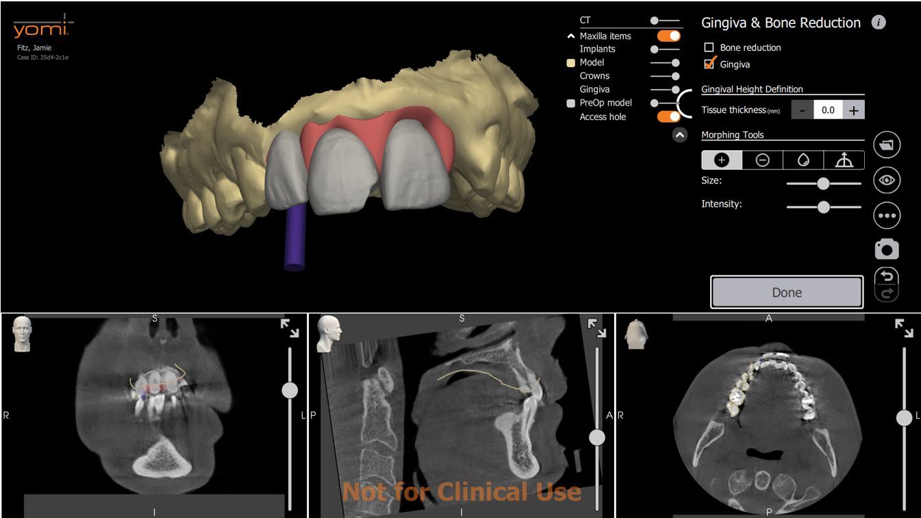
Digital Gingiva Design
Users can now create a digital gingiva directly within the planning environment. For smaller cases, gingiva can be generated based on the restoration and model surface. For full-arch restorations, we connected gingiva design to the alveoplasty plan, allowing the soft tissue to precisely follow the bone reduction plane. This ensures optimal fit and esthetics with minimal manual adjustment.
-
![]()
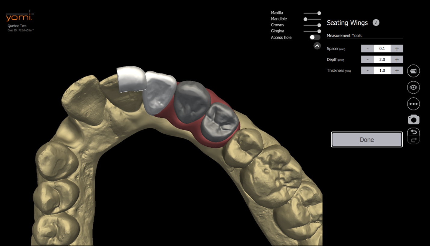
Seating Wings for Restoration Verification
To help users confirm that the restoration is properly seated during bonding process, we introduced seating wings—small, detachable extensions added to the restoration design. These physical guides provide a tactile and visual reference during placement. This feature quickly became a user favorite, as no other software offers an integrated solution for seat verification like this.
Usability Testing & Iteration
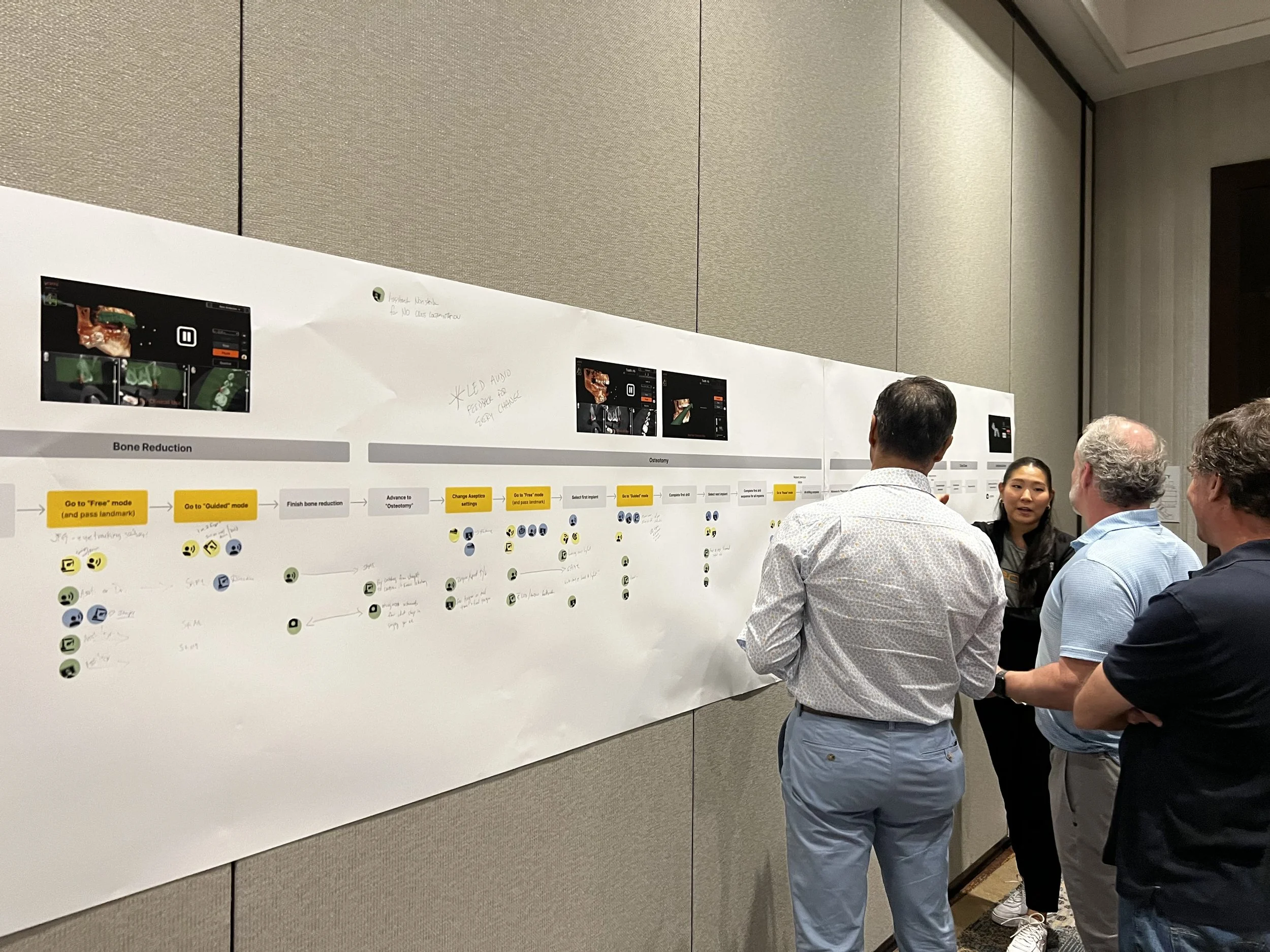
Throughout the project, we conducted extensive usability testing at every stage of the design process, involving both general practitioners (GPs) and lab technicians to ensure clinical relevance and practical usability.
In the early discovery phase, we prioritized relationship-building with clinicians experienced in restorative workflows. We conducted a mix of in-person and remote usability sessions using low- to mid-fidelity prototypes. These sessions focused on shaping an intuitive, efficient workflow and identifying early pain points in the restorative planning process.
In later stages, we ran over 80 hours of usability testing with more than 20 participants. These sessions included detailed user interviews and observational studies, conducted both in person and remotely. The focus shifted to validating specific tools and interactions—such as interpreting the heatmap UI, refining crown morphology, and generating gingiva based on the bone reduction (BR) plan—ensuring the software met both functional and cognitive user needs.
Screengrab from a remote usability testing conducted with one of our key consultants.
What Users Are Saying…
“Absolutely fantastic! This performs extraordinarily well, far beyond anything I expected.”
Dr. Ford
“This is a game changer. It’s going to cut my case planning time dramatically, and I no longer have to juggle multiple software platforms.”
Dr. Jackson
“These tools are so powerful, I can generate a temp design without even needing an intraoral scan.”
Jessie (Lab Technician)
Key Findings From Usability Testing
✅ What Worked Well
Flexible Navigation and Control
Users valued the freedom to undo actions, skip non-critical steps, and revisit earlier stages without penalty, giving them a sense of control and efficiency.
Simplicity Over Complexity
The intuitive toolset was a major win. Users found the interface easy to understand and strongly preferred its simplicity. They did not request additional features or parameters unless they directly improved functionality.
Appreciation for Seating Wings
The addition of seating wings was a notable highlight. Users had previously relied on workarounds in other platforms to achieve the same outcome and were pleased to see this included natively.
⚠️ Key Areas for Improvement
Manual Alignment Workflow
The initial version of manual scan alignment felt overly manual and lacked visual aids or accuracy validation tools. Users wanted more guidance and smarter alignment assistance.
Heatmap Sensitivity and Performance
Users emphasized the critical importance of accurate contact visualization. They requested a more responsive and sensitive heatmap tool to better evaluate contact points with adjacent and opposing teeth.
Object Organization and Defaults
Users expressed a need for clearer object organization and more customizable or context-aware default values—especially for restorative components like abutments and crowns.
Key Iterations Based on Usability Insights
-
Enhanced Heatmap Tool
We significantly improved the heatmap's responsiveness and introduced new controls for customizing contact thresholds and toggling between intersection and clearance views. This gave users more precise feedback for achieving optimal occlusal and proximal contacts.
-
Smart Scan Alignment with Accuracy Validation
Based on user feedback about the overly manual alignment process, we introduced auto-alignment of scans. We also added tools to visually assess alignment accuracy, helping users validate and adjust as needed with greater confidence.
-
New CT-Only Restorative Workflow
To support cases involving singles and short-span bridges, we added a dedicated CT-only workflow. This eliminates unnecessary steps for cases that don’t require full IOS data, making the process faster and more efficient.
What did I do post-launch?
Maintained strong connections with key opinion leaders (KOLs) beyond LMR
Monitored product usage data and system logs
Managed and analyzed bugs, voice-of-customer (VOC) feedback, and user insights
Created a product charter to guide and roadmap future releases
Supported the clinical training team by contributing to training materials
Collaboration with Developers
*
Collaboration with Developers *
Weekly Check-ins with Leadership
I presented findings from user interviews and usability testing, along with mockups and prototypes. These discussions guided design decisions that balanced user needs with technical and time constraints, often prioritizing high-value, low-effort solutions.
Tradeoff Discussions
I closely collaborated with engineers to evaluate technical feasibility, explore alternative solutions when limitations arose, discuss trade-offs, and ensure alignment between design intent and implementation, maintaining a balance between user needs, constraints, and project goals.
Design Handoff
I provided detailed Figma prototypes and mockups, accompanied by written design requirement documents that clearly outlined interactions and edge cases. All design artifacts, tasks, and updates were tracked in Jira to ensure full visibility and accountability.
Post-Handoff Collaboration
I participated in biweekly sprint demos to review progress, provide design feedback, and ensure alignment. Through daily check-ins with engineers, I supported implementation, tested builds, tracked issues, and submitted bug reports to maintain quality.
Reflection & Next Steps
-
Less is more — simple solutions made the biggest impact.
Sometimes you have to pick your battles and focus on what really matters.
The smallest touches often bring the most delight to users.
Users don’t always say what they mean — it’s important to look beyond their words.
-
Users often got stuck on very small details.
Time constraints meant I had to make tough tradeoffs.
Building trust with developers took patience and consistency.
-
Support final restoration design by adding photogrammetry, manufacturer components, milling abilities, etc.
Explore automated planning to streamline workflows.
Support the clinical team in driving adoption and making the product part of everyday practice.